Full-text PDF is available for most of the papers listed below. HTML is also available for some of the papers. Technical reports are also included at the end of the paper list. I'm happy to mail copies of any of the others, please send me e-mail containing your regular mailing address and the papers you're interested in.
Revisiting Non-Parametric Matching Cost Volumes for Robust and Generalizable Stereo Matching
Stereo matching is a classic challenging problem in computer vision, which has recently witnessed remarkable progress by Deep Neural Networks (DNNs). This paradigm shift leads to two interesting and entangled questions that have not been addressed well. First, it is unclear whether stereo matching DNNs that are trained from scratch really learn to perform matching well. This paper studies this problem from the lens of white-box adversarial attacks. It presents a method of learning stereo-constrained photometrically-consistent attacks, which by design are weaker adversarial attacks, and yet can cause catastrophic performance drop for those DNNs. This observation suggests that they may not actually learn to perform matching well in the sense that they should otherwise achieve potentially even better after stereo-constrained perturbations are introduced. Second, stereo matching DNNs are typically trained under the simulation-to-real (Sim2Real) pipeline due to the data hungriness of DNNs. Thus, alleviating the impacts of the Sim2Real photometric gap in stereo matching DNNs becomes a pressing need. Towards joint adversarially robust and domain generalizable stereo matching, this paper proposes to learn DNN-contextualized binary-pattern-driven non-parametric cost- volumes. It leverages the perspective of learning the cost aggregation via DNNs, and presents a simple yet expressive design that is fully end-to-end trainable, without resorting to specific aggregation inductive biases. In experiments, the proposed method is tested in the SceneFlow dataset, the KITTI2015 dataset, and the Middlebury dataset. It significantly improves the adversarial robustness, while retaining accuracy performance comparable to state-of-the-art methods. It also shows a better Sim2Real generalizability.
Cheng, K. and Wu, T. and Healey, C. G. Revisiting Non-Parametric Matching Cost Volumes for Robust and Generalizable Stereo Matching. In Proceedings of the 36th Conference on Neural Information Processing Systems (NeurIPS 22) Conference (New Orleans, LA, 2022), to appear.

Domain-Specific Text Dictionaries for Text Analytics
We investigate the use of sentiment dictionaries to estimate sentiment for large document collections. Our goal in this paper is a semiautomatic method for extending a general sentiment dictionary for a specific target domain in a way that minimizes manual effort.General sentiment dictionariesmay not contain terms important to the target domain ormay score terms inways that are inappropriate for the target domain. We combine statistical term identification and term evaluation using Amazon Mechanical Turk to extend the EmoLex sentiment dictionary to a domain-specific study of dengue fever. The same approach can be applied to any term-based sentiment dictionary or target domain. We explain how terms are identified for inclusion or re-evaluation and how Mechanical Turk generates scores for the identified terms. Examples are provided that compare EmoLex sentiment estimates before and after it is extended. We conclude by describing how our sentiment estimates can be integrated into an epidemiology surveillance system that includes sentiment visualization and discussing the strengths and limitations of our work.
Villanes, A. and Healey, C. G. "Domain-Specific Text Dictionaries for Text Analytics." International Journal of Data Science and Analytics, https://doi.org/10.1007/s41060-022-00344-x.
Visual Analytics for the Coronavirus COVID-19 Pandemic
The coronavirus disease COVID-19 was first reported in Wuhan, China, on December 31, 2019. The disease has since spread throughout the world, affecting 227.2 million individuals and resulting in 4,672,629 deaths as of September 9, 2021, according to the Johns Hopkins University Center for Systems Science and Engineering. Numerous sources track and report information on the disease, including Johns Hopkins itself, with its well-known Novel Coronavirus Dashboard. We were also interested in providing information on the pandemic. However, rather than duplicating existing resources, we focused on integrating sophisticated data analytics and visualization for region-to-region comparison, trend prediction, and testing and vaccination analysis. Our high-level goal is to provide visualizations of predictive analytics that offer policymakers and the general public insight into the current pandemic state and how it may progress into the future. Data are visualized using a web-based jQuery+Tableau dashboard. The dashboard allows both novice viewers and domain experts to gain useful insights into COVID-19's current and predicted future state for different countries and regions of interest throughout the world.
Healey, C. G., Simmons, S. J., Manivannan, C., and Ro, Y. "Visual Analytics for the Coronavirus COVID-19 Pandemic." Big Data 10, 2 (2022), 95–114.
Visual Analytics of Text Conversation Sentiment and Semantics
This paper describes the design and implementation of a web-based system to visualize large collections of text conversations integrated into a hierarchical four-level-of-detail design. Viewers can visualize conversations: (1) in a streamgraph topic overview for a user-specified time period; (2) as emotion patterns for a topic chosen from the streamgraph; (3) as semantic sequences for a user-selected emotion pattern, and (4) as an emotion-driven conversation graph for a single conversation. We collaborated with the Live Chat customer service group at SAS Institute to design and evaluate our system’s strengths and limitations.
Healey, C. G, Dinakaran, G., Padia, K., Nie, S., Benson, J. R., Ciara, D., Shaw, D., Catalfu, G., and Devarajan, R. "Visual Analytics of Text Conversation Sentiment and Semantics Network Planning." Computer Graphics Forum 40, 6, (2021), 484–499.
Rapid Sequence Matching for Visualization Recommender Systems
We present a method to support high quality visualization recommendations for analytic tasks. Visualization converts large datasets into images that allow viewers to efficiently explore, discover, and validate within their data. Visualization recommenders have been proposed that store past sequences: an ordered collection of design choices leading to successful task completion; then match them against an ongoing visualization construction. Based on this matching, a system recommends visualizations that better support the analysts’ tasks. A problem of scalability occurs when many sequences are stored. One solution would be to index the sequence database. However, during matching we require sequences that are similar to the partially constructed visualization, not only those that are identical. We implement a locality sensitive hashing algorithm that converts visualizations into set representations, then uses Jaccard similarity to store similar sequence nodes in common hash buckets. This allows us to match partial sequences against a database containing tens of thousands of full sequences in less than 100ms. Experiments show that our algorithm locates 95% or more of the sequences found in an exhaustive search, producing high-quality visualization recommendations.
Nie, S., Healey, C. G., Chirkova, R. Y, and Reutter, J. L. Rapid Sequence Matching for Visualization Recommender Systems. In Proceedings of Graphics Interface (GI 2019) Conference (Kingston, Canada, 2019), 1&dash8, https://doi.org/10.20380/GI2019.05
View-Warped Multi-View Soft Shadowing for Local Area Lights
Marrs, A., Watson, B., and Healey, C. G. "View-Warped
Soft Shadowing for Local Area Lights." In Proceedings of
the ACM SIGGRAPH Interactive 3D Graphics and Games
(I3D 2019) Symposium (Montrèal, Canada, 2019).
A System for Generating Storyline Visualizations Using
Hierarchical Task Network Planning
Existing storyline visualization techniques present narratives as
a node-link graph where a sequence of links shows the evolution of
causal and temporal relationships between characters in the
narrative. These techniques make a number of simplifying
assumptions about the narrative structure, however. They assume
that all narratives progress linearly in time, with a well-defined
beginning, middle, and end. They assume that the narrative is
complete prior to visualization. They also assume that at least
two participants interact at every event. Finally, they assume
that all events in the narrative occur along a single
timeline. Thus, while existing techniques are suitable for
visualizing linear narratives, they are not well suited for
visualizing narratives with multiple timelines, non-linear
narratives such as those with flashbacks, or for narratives that
contain events with only one participant. In our previous work we
presented Yarn, a system for automatic construction and
visualization of narratives with multiple timelines. Yarn employs
hierarchical task network planning to generate all possible
narrative timelines and visualize them in a web-based
interface. In this work, we extend Yarn to support non-linear
narratives with flashbacks and flash-forwards, and non-linear
point-of-view narratives. Our technique supports both
singleparticipant as well as multi-participant events in the
narrative, and constructs both linear as well as non-linear
narratives. Additionally, it enables pairwise comparison within a
group of multiple narrative timelines.
Padia, K., Kaveen, H. B., and Healey, C. G. "A System for
Generating Storyline Visualizations Using Hierarchical Task
Network Planning." Computer & Graphics 78
(2019), 64–75.
View-Warped Multi-View Soft Shadowing for Local Area Lights
Rendering soft shadows cast by dynamic objects in real time with
few visual artifacts is challenging to achieve. We introduce a new
algorithm for local light sources that exhibits fewer artifacts
than fast single-view approximations and is faster than
high-quality multi-view solutions. Inspired by layered depth
images, image warping, and point-based rendering, our algorithm
traverses complex occluder geometry once and creates an optimized
multi-view point cloud as a proxy. We then render many depth maps
simultaneously on graphics hardware using GPU Compute. By
significantly reducing the time spent producing depth maps, our
solution presents a new alternative for applications that cannot
yet afford the most accurate methods, but that strive for higher
quality shadows than possible with common approximations.
Marrs, M., Watson, B., and Healey, C. G.
"View-Warped Multi-View Soft Shadowing for Local Area Lights."
Journal of Computer Graphics Tools 7, 3 (2018), 1–28.
Impressionism-Inspired Data Visualizations are Both Functional and Liked
Creating data visualizations that are functional and aesthetically
pleasing is important yet difficult. Here we ask whether creating
visualizations using the painterly techniques of impressionist-era
artists may help. In two experiments we rendered weather data from
the Intergovernmental Panel on Climate Change into a common
visualization style, glyph, and impressionism-inspired painting
styles: sculptural, containment, and impasto. Experiment 1 tested
participants' recognition memory for these visualizations and
found that impasto, a style resembling paintings like Starry Night
(1889) by Vincent van Gogh, was comparable to glyphs and superior
to the other impressionist styles. Experiment 2 tested
participants' ability to report the prevalence of the colour blue
(representative of a single weather condition) within each
visualization, and here impasto was superior to glyphs and the
other impressionist styles. Questionnaires administered at study
completion revealed that styles participants liked had higher task
performance relative to less liked styles. Incidental eye tracking
in both studies also found impressionist visualizations elicited
greater visual exploration than glyphs. These results offer a
proof-of-concept that the painterly techniques of impressionism,
and particularly those of the impasto style, can create
visualizations that are functional, liked, and encourage visual
exploration.
Kozik, P., Tateosian, L., Healey, C. G., and Enns, J. T.
"Impressionsim-Inspired Data Visualizations are Both Functional
and Liked." Psychology of Aesthetics, Creativity,
and the Arts, (2018), http://dx.doi.org/10.1037/aca0000175.
Yarn: Generating Storyline Visualizations Using HTN Planning
Existing storyline visualization techniques represent narratives
as a node-link graph where a sequence of links shows the evolution
of causal and temporal relationships between characters in the
narrative. These techniques make a number of simplifying
assumptions about the narrative structure, however. They assume
that all narratives progress linearly in time, with a well defined
beginning, middle, and end. They assume that at least two
participants interact at every event. Finally, they assume that
all events in the narrative occur along a single timeline. Thus,
while existing techniques are suitable for visualizing linear
narratives, they are not well suited for visualizing narratives
with multiple timelines, nor for narratives that contain events
with only one participant. In this paper we present Yarn, a system
for generating and visualizing narratives with multiple
timelines. Along with multi-participant events, Yarn can also
visualize single-participant events in the
narrative. Additionally, Yarn enables pairwise comparison of the
multiple narrative timelines.
Padia, K., Kaveen, H. B., and Healey, C. G. Yarn: Generating
Storyline Visualizations Using HTN Planning. In Proceedings of
Graphics Interface (GI 2018) Conference (Toronto, Canada, 2018),
26–33.
Visualizing Deep Neural Networks for Text Analytics
Deep neural networks (DNNs) have made tremendous progress in
many different areas in recent years. How these networks function
internally, however, is often not well understood. Advances in
understanding DNNs will benefit and accelerate the development of
the field. We present TNNVis, a visualization system that supports
understanding of deep neural networks specifically designed to
analyze text. TNNVis focuses on DNNs composed of fully connected
and convolutional layers. It integrates visual encodings and
interaction techniques chosen specifically for our tasks. The tool
allows users to: (1) visually explore DNN models with arbitrary
input using a combination of node–link diagrams and matrix
representation; (2) quickly identify activation values, weights,
and feature map patterns within a network; (3) flexibly focus on
visual information of interest with threshold, inspection, insight
query, and tooltip operations; (4) discover network activation and
training patterns through animation; and (5) compare differences
between internal activation patterns for different inputs to the
DNN. These functions allow neural network researchers to examine
their DNN models from new perspectives, producing insights on how
these models function. Clustering and summarization techniques are
employed to support large convolutional and fully connected
layers. Based on several part of speech models with different
structure and size, we present multiple use cases where
visualization facilitates an understanding of the models. Nie, S., Healey, C. G., Padia, K., Leeman-Munk, S., Benson, J. R.,
Ciara, D., Sethi, S., and Devarajan, R. "Visualizing Deep Neural
Networks for Text Analytics." In Proceedings Pacific
Visualization 2018 (PacVis 2018) Conference (Kobe City, Japan, 2018),
180–189.
Dengue Fever Surveillance in India Using Text Mining in Public Media
Despite the improvement in health conditions across the world
during the past decades, communicable diseases remain among the
leading mortality causes in many countries. Combating communicable
diseases depends on surveillance, preventive measures, outbreak
investigation and the establishment of control mechanisms. Delays
in obtaining country level data of confirmed communicable diseases
cases, like dengue fever, are prompting new efforts for short- to
medium-term data. News articles highlight dengue infections and
they can reveal how public health messages, expert findings, and
uncertainties are communicated to the public. In this paper, we
analyze dengue news articles in Asian countries, with a focus in
India, for each month in 2014. We investigate how the reports
cluster together, and uncover how dengue cases, public health
messages and research findings are communicated in the press. Our
main contributions are to: (1) uncover underlying topics from news
articles that discuss dengue in Asian countries in 2014; (2)
construct topic evolution graphs through the year; and (3) analyze
the life cycle of dengue news articles in India, then relate
them to rainfall, monthly reported dengue cases, and the Breteau
Index. We show that the five main topics discussed in the
newspapers in Asia in 2014 correspond to: (1) prevention; (2)
reported dengue cases; (3) politics; (4) prevention relative to
other diseases; and (5) emergency plans. We identify that rainfall
has 0.92 correlation with the reported dengue cases extracted from
news articles. Based in our findings, we conclude that the
proposed method facilitates in the effective discovery of
evolutionary dengue themes and patterns. Villanes, A., Griffith, E., Rappa, M., and Healey,
C. G. "Dengue Fever Surveillance in India Using Text Mining
in Public Media." American Journal of Tropic Medicine &
Hygiene 98, 1, (2018), pp. 181–191.
The Utility of Beautiful Visualizations
Geovisualizations provide a means to inspect large complex
multivariate datasets for information that would not otherwise be
available with a tabular view or summary statistics
alone. Aesthetically appealing visualizations can elicit prolonged
exploration and encourage discovery. Creating data
geovisualizations that are effective and beautiful is an important
yet difficult challenge. Here we present a tool for rendering
geovisualizations of continuous spatial data using impressionist
painterly techniques. The techniques, which have been tested in
controlled studies, vary the visual properties (e.g., hue, size,
and tilt) of brush strokes to represent multiple data attributes
simultaneously in each location. To demonstrate this technique, we
render two examples: 1) weather data attributes (e.g.,
temperature, windspeed, atmospheric pressure) from the NOAA Global
Forecast System and 2) fragile state indices as assessed by the
Foreign Policy Magazine. These examples demonstrate how open
source geospatial visualizations can harness aesthetics to enhance
visual communication and viewer engagement. Tateosian, L., Amindarbari, R., Healey, C. G., Kozik, P., and
Enns, J. T. "The Utility of Beautiful Visualizations."
In Proceedings Free and Open Source Software for Geospatial
(FOSS4G 2017) Conference (Boston, Massachusetts, 2017),
157–162. This paper describes a prototype tangible six degree of freedom
(6 DoF) input device that is inexpensive and intuitive to use: a
cube with colored corners of specific shapes, tracked by a single
camera, with pose estimated in real time. A tracking and automatic
color adjustment system are designed so that the device can work
robustly with noisy surroundings and is invariant to changes in
lighting and background noise. A system evaluation shows good
performance for both refresh (above 60 FPS on average) and
accuracy of pose estimation (average angular error of about
1°). A user study of 3D rotation tasks shows that the device
outperforms other 6 DoF input devices used in a similar desktop
environment. The device has the potential to facilitate
interactive applications such as games as well as viewing 3D
information. Chen, Z., Healey, C. G., and St. Amant, R. "Performance
Characteristics of a Camera-Based Tangible Input Device for
Manipulation of 3D Information." In Proceedings Graphics
Interface 2017 (GI 2017) (Edmonton, Canada, 2017), 74–81.
Real-Time Independent Rasterization for Multi-View
Rendering
Existing graphics hardware parallelizes view generation poorly,
placing many multi-view effects—such as soft shadows,
defocus blur, and reflections—out of reach for real-time
applications. We present emerging solutions that address this
problem using a high density point set tailored per frame to the
current multi-view configuration, coupled with relatively simple
reconstruction kernels. Points are a more flexible rendering
primitive, which we leverage to render many high resolution views
in parallel. Preliminary results show our approach accelerates
point generation and the rendering of multi-view soft shadows up
to 9×. Marrs, A., Watson, B., and Healey, C. G. "Real-Time View
Independent Rasterization for Multi-View Rendering."
Proceedings 38th Annual Conference of the European Association for
Computer Graphics (EuroGraphics 2017) (Lyon, France, 2017),
17–20.
Large Image Collection Visualization Using Perception-Based
Similarity with Color Features
This paper introduces the basic steps to build a similarity-based
visualization tool for large image collections. We build the
similarity metric s based on human perception. Psychophysical
experiments have shown that human observers can recognize the gist
of scenes within 100 milliseconds (msec) by comprehending the
global properties of an image. Color also plays an important role
in human rapid scene recognition. However, previous works often
neglect color features. We propose new scene descriptors that
preserve the information from coherent color regions, as well as
the spatial layouts of scenes. Experiments show that our
descriptors outperform existing state-of-the-art approaches. Given
the similarity metrics, a hierarchical structure of an image
collection can be built in a top-down manner. Representative
images are chosen for image clusters and visualized using a
force-directed graph. Chen, Z. and Healey, C. G. "Large Image Collection
Visualization Using Perception-Based Similarity with Color
Features." In Proceedings 12th International Symposium on
Visual Computing (ISVC '16) (Las Vegas, Nevada, 2016),
379–390.
Applying Impressionist Painterly Techniques to Data
Visualization
An important task of science is to communicate complex data to
peers and the public. Here we ask whether harnessing the painterly
techniques of impressionist-era painters is beneficial. In two
experiments, participants viewed weather maps from the
International Panel of Climate Change that were rendered using
either an industry-standard technique (glyphs) or one of three
styles inspired from impressionist masters. The glyph technique
used rectangular glyphs that vary properties of color and texture
(e.g. hue, saturation and size) to represent corresponding data
values. For the impressionist styles, regions of maximum contrast
in the underlying data were rendered using brushstroke algorithms
to emphasize interpretational complexity (two distinct layers of
paint where unique regions have greater brushstroke overlap),
indication and detail (unique regions are rendered with increased
brushstroke thickness and density), and visual complexity (unique
regions are rendered with different brushstrokes at a global level
and reinforced with increased brushstroke variation at a local
level). Visual complexity was expected to be more memorable and
allow for more accurate information extraction because it both
draws attention to distinct image regions and engages the viewer
at those locations with increased brushstroke variability. In
Experiment 1 thirty participants completed a new–old recognition
test for which d-prime values of visual complexity and glyph were
comparable, and both superior to the other styles. Experiment 2
tested the accuracy of numerosity estimation with a different
group of thirty participants and here visual complexity was
superior above all other styles. An exit poll completed at the end
of both studies further revealed that the style participants
identified as being "most liked" associated with higher
performance relative those not selected. Incidental eye-tracking
revealed impressionist styles elicited greater visual exploration
over glyphs. These results offer a proof-of-concept that
visualizations based on Impressionist brushstrokes can be
memorable, functional, and engaging. Kozik, P., Tateosian, L., Healey, C. G., and Enns, J.
"Applying Painterly Techniques to Data Visualization."
Journal of Vision (Abstract Issue, Vision Science Society 16th
Annual Meeting, St. Pete Beach, FL) 16, 12, (2016), 188.
Visualizing Static Ensembles for Effective Shape and Data
Comparison
The challenges of cyber situation awareness call for ways to
provide assistance to analysts and decision-makers. In many
fields, analyses of complex systems and activities benefit from
visualization of data and analytical products. Analysts use images
in order to engage their visual perception in identifying features
in the data, and to apply the analysts' domain knowledge. One
would expect the same to be true in the practice of cyber analysts
as they try to form situational awareness of complex
networks. This chapter takes a close look at visualization for
Cyber Situation Awareness. We begin with a basic overview of
scientific and information visualization, and of recent
visualization systems for cyber situation awareness. Then, we
outline a set of requirements, derived largely from discussions
with expert cyber analysts, for a candidate visualization
system. Hao, L., Healey, C. G., Bass. S. A., and Yu, H.-Y.
"Visualizing Static Ensembles for Effective Shape and Data
Comparison." Visualization and Data Analytics 2016,
(San Francisco, California, 2016), 1-10 (10).
Effective Visualization of Temporal Ensembles
An ensemble is a collection of related datasets,
called members, built from a series of runs of a
simulation or an experiment. Ensembles are large, temporal,
multidimensional, and multivariate, making them difficult to
analyze. Another important challenge is visualizing ensembles that
vary both in space and time. Initial visualization techniques
displayed ensembles with a small number of members, or presented
an overview of an entire ensemble, but without potentially
important details. Recently, researchers have suggested combining
these two directions, allowing users to choose subsets of members
to visualization. This manual selection process places the burden
on the user to identify which members to explore. We first
introduce a static ensemble visualization system that
automatically helps users locate interesting subsets of members to
visualize. We next extend the system to support analysis and
visualization of temporal ensembles. We employ 3D shape
comparison, cluster tree visualization, and glyph based
visualization to represent different levels of detail within an
ensemble. This strategy is used to provide two approaches for
temporal ensemble analysis: (1) segment based ensemble
analysis, to capture important shape transition time-steps,
clusters groups of similar members, and identify common shape
changes over time across multiple members; and (2) time-step
based ensemble analysis, which assumes ensemble members are
aligned in time by combining similar shapes at common time-steps.
Both approaches enable users to interactively visualize and
analyze a temporal ensemble from different perspectives at
different levels of detail. We demonstrate our techniques on an
ensemble studying matter transition from hadronic gas to
quark-gluon plasma during gold-on-gold particle collisions. Hao, L., Healey, C. G., and Bass, S. A. "Effective
Visualization of Temporal Ensembles." IEEE Transactions
on Visualization and Computer Graphics 22, 1, (2015),
787–796.
Ensemble Visualization for Cyber Situation Awareness of
Network Security Data
Network security analysis and ensemble data visualization are
two active research areas. Although they are treated as separate
domains, they share many common challenges and
characteristics. Both focus on scalability, time-dependent data
analytics, and exploration of patterns and unusual behaviors in
large datasets. These overlaps provide an opportunity to apply
ensemble visualization research to improve network security
analysis. To study this goal, we propose methods to interpret
network security alerts and flow traffic as ensemble members. We
can then apply ensemble visualization techniques in a network
analysis environment to produce a network ensemble visualization
system. Including ensemble representations provide new, in-depth
insights into relationships between alerts and flow
traffic. Analysts can cluster traffic with similar behavior and
identify traffic with unusual patterns, something that is
difficult to achieve with high-level overviews of large network
datasets. Furthermore, our ensemble approach facilitates analysis
of relationships between alerts and flow traffic, improves
scalability, maintains accessibility and configurability, and is
designed to fit our analysts' working environment, mental models,
and problem solving strategies.
Hao, L., Healey, C. G., and Hutchinson, S. E. "Ensemble
Visualization for Cyber Situation Awareness of Network Security
Data." In Proceedings Visualization for Cyber Security 2015
(Chicago, Illinois, 2015), pp. 25–32. The challenges of cyber situation awareness call for ways to
provide assistance to analysts and decision-makers. In many
fields, analyses of complex systems and activities benefit from
visualization of data and analytical products. Analysts use images
in order to engage their visual perception in identifying features
in the data, and to apply the analysts' domain knowledge. One
would expect the same to be true in the practice of cyber analysts
as they try to form situational awareness of complex
networks. This chapter takes a close look at visualization for
Cyber Situation Awareness. We begin with a basic overview of
scientific and information visualization, and of recent
visualization systems for cyber situation awareness. Then, we
outline a set of requirements, derived largely from discussions
with expert cyber analysts, for a candidate visualization
system. Healey, C. G., Hao, L., and Hutchinson,
S. E. "Visualizations and Analysts," in Cyber Defense
and Situation Awareness, A. Kott, C. Wang and R. Erbacher,
Eds. New York, New York: Springer Publishing Company,
pp. 145–165.
Visualizing Likelihood Density Functions via Optimal Region
Projection
Effective visualization of high-likelihood regions of parameter
space is severely hampered by the large number of parameter
dimensions that many models have. We present a novel technique,
Optimal Percentile Region Projection, to visualize a
high-dimensional likelihood density function that enables the
viewer to understand the shape of the high-likelihood
region. Optimal Percentile Region Projection has three novel
components: first, we select the region of high likelihood in the
high-dimensional space before projecting its shadow into a
lower-dimensional projected space. Second, we analyze features on
the surface of the region in the projected space to select the
projection direction that shows the most interesting parameter
dependencies. Finally, we use a three-dimensional projection space
to show features that are not salient in only two dimensions. The
viewer can also choose sets of axes to project along to explore
subsets of the parameter space, using either the original
parameter axes or principal-component axes. The technique was
evaluated by our domain-science collaborators, who found it to be
superior to their existing workflow both when there were
interesting dependencies between parameters and when there were
not. Canary, H., Taylor II, R. M., Quammen, C., Pratt, S., Gomez,
F., O'Shea, B., and Healey, C. G. "Visualizing Likelihood
Density Functions via Optimal Region Projection." Computers
& Graphics 41, (2014), 62–71.
Flexible Web Visualization for Alert-Based Network
Security Analytics
This paper describes a web-based visualization system designed
for network security analysts at the U.S. Army Research Laboratory
(ARL). Our goal is to provide visual support to the analysts as
they investigate security alerts for malicious activity within
their systems. Our ARL collaborators identified a number of
important requirements for any candidate visualization
system. These relate to the analyst's mental models and working
environment, and to the visualization tool's configurability,
accessibility, scalability, and "fit" with existing
analysis strategies. To meet these requirements, we designed and
implement a web-based tool that uses different types of charts as
its core representation framework. A JavaScript charting library
(RGraph) was extended to provide the interface extensibility and
correlation capabilities needed to support analysts as they
explore different hypotheses about a potential attack. We describe
key elements of our design, explain how an analyst's intent is
used to generate different visualizations, and show how the
system's interface allows an analyst to rapidly produce a sequence
of visualizations to explore specific details about a potential
attack as they arise. We conclude with a discussion of plans to
further improve the system, and to collect feedback from our ARL
colleagues on its strengths and limitations in real-world analysis
scenarios. Hao, L., Healey, C. G., and Hutchinson, S. E. "Flexible
Web Visualization for Alert-Based Network Security
Analytics." In Proceedings Visualization for Cyber Security
2013 (Atlanta, Georgia, 2013), pp. 33–40.
On the Limits of Resolution and Visual Angle in
Visualization
This article describes a perceptual level-of-detail approach
for visualizing data. Properties of a dataset that cannot be
resolved in the current display environment need not be shown, for
example, when too few pixels are used to render a data element, or
when the element's subtended visual angle falls below the acuity
limits of our visual system. To identify these situations, we
asked: (1) What type of information can a human user perceive in a
particular display environment? (2) Can we design visualizations
that control what they represent relative to these limits? and (3)
Is it possible to dynamically update a visualization as the
display environment changes, to continue to effectively utilize
our perceptual abilities? To answer these questions, we conducted
controlled experiments that identified the pixel resolution and
subtended visual angle needed to distinguish different values of
luminance, hue, size, and orientation. This information is
summarized in a perceptual display hierarchy, a formalization
describing how many pixels—resolution—and how much
physical area on a viewer's retina—visual angle—is
required for an element's visual properties to be readily seen. We
demonstrate our theoretical results by visualizing historical
climatology data from the International Panel for Climate
Change. Healey, C. G. and Sawant, A. P. "On the Limits of
Resolution and Visual Angle in Visualization." ACM
Transactions on Applied Perception 9, 4, (2012), article 20.
Interest Driven Navigation in Visualization
This paper describes a new method to explore and discover
within a large dataset. We apply techniques from preference
elicitation to automatically identify data elements that are of
potential interest to the viewer. These "elements of
interest" are bundled into spatially local clusters, and
connected together to form a graph. The graph is used to build
camera paths that allow viewers to "tour" areas of
interest within their data. It is also visualized to provide
wayfinding cues. Our preference model uses Bayesian classification
to tag elements in a dataset as interesting or not
interesting to the viewer. The model responds in real-time,
updating the elements of interest based on a viewer's
actions. This allows us to track a viewer's interests as they
change during exploration and analysis. Viewers can also interact
directly with interest rules the preference model defines. We
demonstrate our theoretical results by visualizing historical
climatology data collected at locations throughout the world. Healey, C. G. and Dennis, B. M. "Interest Driven
Navigation in Visualization."IEEE Transactions on
Visualization and Computer Graphics 18, 10, (2012),
1744–1756.
Attention and Visual Memory in Visualization and Computer
Graphics
A fundamental goal of visualization is to produce images of
data that support visual analysis, exploration, and discovery of
novel insights. An important consideration during visualization
design is the role of human visual perception. How we
“see” details in an image can directly impact a
viewer’s efficiency and effectiveness. This article surveys
research on attention and visual perception, with a specific focus
on results that have direct relevance to visualization and visual
analytics. We discuss theories of low-level visual perception,
then show how these findings form a foundation for more recent
work on visual memory and visual attention. We conclude with a
brief overview of how knowledge of visual attention and visual
memory is being applied in visualization and graphics. We also
discuss how challenges in visualization are motivating research in
psychophysics. Healey, C. G. and Enns, J. T. "Attention and Visual Memory
in Visualization and Computer Graphics." IEEE
Transactions on Visualization and Computer Graphics 18, 7,
(2012), 1170–1188.
Exploring Ensemble Visualization
An ensemble is a collection of related datasets. Each dataset,
or member, of an ensemble is normally large,
multidimensional, and spatio-temporal. Ensembles are used
extensively by scientists and mathematicians, for example, by
executing a simulation repeatedly with slightly different input
parameters and saving the results in an ensemble to see how
parameter choices affect the simulation. To draw inferences from
an ensemble, scientists need to compare data both within and
between ensemble members. We propose two techniques to support
ensemble exploration and comparison: a pairwise sequential
animation method that visualizes locally neighboring members
simultaneously, and a screen door tinting method that
visualizes subsets of members using screen space subdivision. We
demonstrate the capabilities of both techniques, first using
synthetic data, then with simulation data of heavy ion collisions
in high-energy physics. Results show that both techniques are
capable of supporting meaningful comparisons of ensemble data. Phadke, M. N., Pinto, L., Alabi, O., Harter, J., Taylor II,
R. M., Wu, X., Petersen, H., Bass, S. A., and Healey,
C. G. "Exploring Ensemble Visualization."Visualization
and Data Analytics 2012, (San Francisco, California, 2012),
vol. 8294, paper 0B, pp. 1–12.
Comparative Visualization of Ensembles Using Ensemble Surface
Slicing
By definition, an ensemble is a set of surfaces or volumes
derived from a series of simulations or experiments. Sometimes the
series is run with different initial conditions for one parameter
to determine parameter sensitivity. The understanding and
identification of visual similarities and differences among the
shapes of members of an ensemble is an acute and growing challenge
for researchers across the physical sciences. More specifically,
the task of gaining spatial understanding and identifying
similarities and differences between multiple complex geometric
data sets simultaneously has proved challenging. This
paper proposes a comparison and visualization technique to support
the visual study of parameter sensitivity. We present a novel
single-image view and sampling technique which we call Ensemble
Surface Slicing (ESS). ESS produces a single image that is useful
for determining differences and similarities between surfaces
simultaneously from several data sets. We demonstrate the
usefulness of ESS on two real-world data sets from our
collaborators. Alabi, O., Wu, X., Harter, J., Phadke, M. N., Pinto, L.,
Petersen, H., Bass, S. A., Keifer, M., Zhong, S., Healey, C. G.,
and Taylor II, R. M. "Comparative Visualization of Ensembles
Using Ensemble Surface Slicing." Visualization and Data
Analytics 2012, (San Francisco, California, 2012), vol. 8294,
paper 0U, pp. 1–12.
Visualizing Combinatorial Auctions
We propose a novel scheme to visualize combinatorial auctions;
auctions that involve the simultaneous sale of multiple
items. Buyers bid on complementary sets of items, or bundles,
where the utility of securing all the items in the bundle is more
than the sum of the utility of the individual items. Our
visualizations use concentric rings divided into arcs to visualize
the bundles in an auction. The arcs’ positions and overlaps
allow viewers to identify and follow bidding
strategies. Properties of color, texture, and motion are used to
represent different attributes of the auction, including active
bundles, prices bid for each bundle, winning bids, and
bidders’ interests. Keyframe animations are used to show
changes in an auction over time. We demonstrate our visualization
technique on a standard testbed dataset generated by researchers
to evaluate combinatorial auction bid strategies, and on recent
Federal Communications Commission (FCC) auctions designed to
allocate wireless spectrum licenses to cell phone service
providers. Hsiao, J. P.-L. and Healey, C. G. "Visualizing
Combinatorial Auctions."The Visual Computer 27,
6–8, (2011), 633–643.
Interactive Visual Summarization of Multidimensional
Data
Visualization has become integral to the knowledge discovery
process across various domains. However, challenges remain in the
effective use of visualization techniques, especially when
displaying, exploring and analyzing large, multidimensional
datasets, such as weather and meteorological data. Direct
visualizations of such datasets tend to produce images that are
cluttered with excess detail and are ineffective at communicating
information at higher levels of abstraction. To address this
problem we provide a visual summarization framework to intuitively
reduce the data to its important and relevant
characteristics. Summarization is performed in three broad
steps. First, high-relevance data elements and clusters of similar
data attributes are identified to reduce a dataset’s size
and dimensionality. Next, patterns, relationships and outliers are
extracted from the reduced data. Finally, the extracted summary
characteristics are visualized to the user. Such visualizations
reduce excess visual detail and are more suited to the rapid
comprehension of complex data. Users can interactively guide the
summarization process gaining insight into both how and why the
summary results are produced. Our framework improves the benefits
of mathematical analysis and interactive visualization by
combining the strengths of the computer and the user to generate
high-quality summaries. Initial results from applying our
framework to large weather datasets have been positive, suggesting
that our approach could be beneficial for a wide range of domains
and applications. Kocherlakota, S. and Healey, C. G. "Interactive Visual
Summarization of Multidimensional Data." In IEEE
International Conference on Man, Systems, and Cybernetics
2009 (San Antonio, Texas, 2009), pp. 362–369.
Visual Perception and Mixed-Initiative Interaction For
Assisted Visualization Design
This paper describes the integration of perceptual guidelines
from human vision with an AI-based mixed-initiative search
strategy. The result is a visualization assistant called
ViA, a system that collaborates with its users to identify
perceptually salient visualizations for large, multidimensional
datasets. ViA applies knowledge of low-level human vision to: (1)
evaluate the effectiveness of a particular visualization for a
given dataset and analysis tasks; and (2) rapidly direct its
search towards new visualizations that are most likely to offer
improvements over those seen to date. Context, domain expertise,
and a high-level understanding of a dataset are critical to
identifying effective visualizations. We apply a mixed-initiative
strategy that allows ViA and its users to share their different
strengths and continually improve ViA's understanding of a user's
preferences. We visualize historical weather conditions to compare
ViA's search strategy to exhaustive analysis, simulated annealing,
and reactive tabu search, and to measure the improvement provided
by mixed-initiative interaction. We also visualize intelligent
agents competing in a simulated online auction to evaluate ViA's
perceptual guidelines. Results from each study are positive,
suggesting that ViA can construct high-quality visualizations for
a range of real-world datasets. Healey, C. G., Kocherlakota, S., Rao, V., Mehta, R., and
St. Amant, R. "Visual Perception and Mixed-Initiative
Interaction for Assisted Visualization Design." IEEE
Transactions on Visualization and Computer Graphics 14, 2, (2008),
396–411.
Visualizing Multidimensional Query Results Using
Animation
Effective representation of large, complex collections of
information (datasets) presents a difficult
challenge. Visualization is a solution that uses a visual
interface to support efficient analysis and discovery within the
data. Our primary goal in this paper is a technique that allows
viewers to compare multiple query results representing
user-selected subsets of a multidimensional dataset. We present an
algorithm that visualizes multidimensional information along a
space-filling spiral. Graphical glyphs that vary their position,
color, and texture appearance are used to represent attribute
values for the data elements in each query result. Guidelines from
human perception allow us to construct glyphs that are
specifically designed to support exploration, facilitate the
discovery of trends and relationships both within and between data
elements, and highlight exceptions. A clustering algorithm applied
to a user-chosen ranking attribute bundles together similar data
elements. This encapsulation is used to show relationships across
different queries via animations that morph between query
results. We apply our techniques to the MovieLens recommender
system, to demonstrate their applicability in a real-world
environment, and then conclude with a simple validation experiment
to identify the strengths and limitations of our design, compared
to a traditional side-by-side visualization. Sawant, A. P. and Healey, C. G. "Visualizing
Multidimensional Query Results Using Animation." In
Proceedings Visualization and Data Analysis 2008 (San Jose,
California, 2008), vol. 6809, paper 04, pp. 1–12.
ChipViz: Visualizing Memory Chip Test Data
This paper presents a technique that allows test engineers to
visually analyze and explore within memory chip test data. We
represent the test results from a generation of chips along a
traditional grid and a spiral. We also show
correspondences in the test results across multiple generations of
memory chips. We use simple geometric "glyphs" that vary
their spatial placement, color, and texture properties to
represent the critical attribute values of a test. When shown
together, the glyphs form visual patterns that support
exploration, facilitate discovery of data characteristics,
relationships, and highlight trends and exceptions in the test
data that are often difficult to identify with existing
statistical tools. Sawant, A. P., Raina, R., and Healey, C. G. "ChipViz:
Visualizing Memory Chip Test Data." In Proceedings Third
International Symposium on Visual Computing 2007 (Lake Tahoe,
Nevada, 2007), pp. 711–720. In many applications, it's important to understand the
individual values of, and relationships between, multiple related
scalar variables defined across a common domain. Several
approaches have been proposed for representing data in these
situations. In this paper we focus on strategies for the
visualization of multivariate data that rely on color mixing. In
particular, through a series of controlled observer experiments,
we seek to establish a fundamental understanding of the
information-carrying capacities of two alternative methods for
encoding multivariate information using color: color blending and
color weaving. We begin with a baseline experiment in which we
assess participants' abilities to accurately read numerical data
encoded in six different basic color scales defined in the L*a*b*
color space. We then assess participants' abilities to read
combinations of 2, 3, 4 and 6 different data values represented in
a common region of the domain, encoded using either color blending
or color weaving. In color blending a single mixed color is formed
via linear combination of the individual values in L*a*b* space,
and in color weaving the original individual colors are displayed
side-by-side in a high frequency texture that fills the region. A
third experiment was conducted to clarify some of the trends
regarding the color contrast and its effect on the magnitude of
the error that was observed in the second experiment. The results
indicate that when the component colors are represented
side-by-side in a high frequency texture, most participants'
abilities to infer the values of individual components are
significantly improved, relative to when the colors are
blended. Participants' performance was significantly better with
color weaving particularly when more than 2 colors were used, and
even when the individual colors subtended only 3 minutes of visual
angle in the texture. However, the information-carrying capacity
of the color weaving approach has its limits. We found that
participants' abilities to accurately interpret each of the
individual components in a high frequency color texture typically
falls off as the number of components increases from 4 to 6. We
found no significant advantages, in either color blending or color
weaving, to using color scales based on component hues that are
more widely separated in the L*a*b* color space. Furthermore, we
found some indications that extra difficulties may arise when
opponent hues are employed. Hagh-Shenas, H., Kim, S., Interrante, V., and Healey,
C. G. "Weaving Versus Blending: A Quantitative Assessment of
the Information Carrying Capacities of Two Alternative Methods for
Conveying Multivariate Data With Color." IEEE
Transactions on Visualization and Computer Graphics 13, 6,
(2007), 1270–1277.
Engaging Viewers Through Nonphotorealistic
Visualizations
Research in human visual cognition suggests that beautiful
images can engage the visual system, encouraging it to linger in
certain locations in an image and absorb subtle details. By
developing aesthetically pleasing visualizations of data, we aim
to engage viewers and promote prolonged inspection, which can lead
to new discoveries within the data. We present three new
visualization techniques that apply painterly rendering styles to
vary interpretational complexity (IC), indication and detail (ID),
and visual complexity (VC), image properties that are important to
aesthetics. Knowledge of human visual perception and
psychophysical models of aesthetics provide the theoretical basis
for our designs. Computational geometry and nonphotorealistic
algorithms are used to preprocess the data and render the
visualizations. We demonstrate the techniques with visualizations
of real weather and supernova data. Tateosian, L. G., Healey, C. G., and Enns, J. T. "Engaging
Viewers Through Nonphotorealistic Visualizations." In
Proceedings Fifth International Symposium on Non-Photorealistic
Animation and Rendering 2007 (San Diego, California, 2007),
pp. 93–102. This paper presents a technique that allows viewers to visually
analyze, explore, and compare a storage controller's
performance. We present an algorithm that visualizes storage
controller's performance metrics along a traditional 2D
grid or a linear space-filling spiral. We use
graphical "glyphs" (simple geometric objects) that vary
in color, spatial placement and texture properties to represent
the attribute values contained in a data element. When shown
together, the glyphs form visual patterns that support
exploration, facilitate discovery of data characteristics,
relationships, and highlight trends and exceptions. Sawant, A.P., Vanninen, M., and Healey,
C. G. "PerfViz:A Visualization Tool for Analyzing,
Exploring, and Comparing Storage Controller Performance
Data." In Proceedings Visualization and Data Analysis 2007
(San Jose, California, 2007), vol. 6495, paper 07, pp. 1-11.
Stevens Dot Patterns for 2D Flow Visualization
This paper describes a new technique to visualize 2D flow
fields with a sparse collection of dots. A cognitive model
proposed by Ken Stevens describes how spatially local
configurations of dots are processed in parallel by the low-level
visual system to perceive orientations throughout the image. We
integrate this model into a visualization algorithm that converts
a sparse grid of dots into patterns that capture flow orientations
in an underlying flow field. Because our visualizations are based
on experimental results from human vision, the patterns are
perceptually salient. We describe how our algorithm supports large
flow fields that exceed the capabilities of a display device, and
demonstrate how to include properties like direction and velocity
in our visualizations. We conclude by applying our technique to 2D
slices from a simulated supernova collapse. Tateosian, L. G., Dennis, B. M., and Healey,
C. G. "Stevens Dot Patterns for 2D Flow Visualization."
In Proceedings Third International Symposium on Applied Perception
in Graphics and Visualization 2006 (Boston, Massachusetts, 2006),
pp. 93-100. Although a wide range of virtual reality (VR) systems are in
use, there are few guidelines to help system and application
developers select the components most appropriate for the domain
problem they are investigating. Using the results of an empirical
study, we developed such guidelines for the choice of display
environment for four specific, but common, volume visualization
problems: identification and judgment of the size, shape, density,
and connectivity of objects present in the volume. These tasks are
derived from questions being asked by collaborators studying
Cystic Fibrosis. We compared user performance in three different
stereo VR systems: (1) head-mounted display (HMD); (2) fish tank
VR (fish tank); and (3) fish tank VR augmented with a haptic
device (haptic). HMD participants were placed "inside"
the volume and walked within it to explore its structure. Fish
tank and haptic participants saw the entire volume on-screen and
rotated it to view it from different perspectives. Response time
and accuracy were used to measure performance. Results showed that
the fish tank and haptic groups were significantly more accurate
at judging the shape, density, and connectivity of objects and
completed the tasks significantly faster than the HMD
group. Although the fish tank group was itself significantly
faster than the haptic group, there were no statistical
differences in accuracy between the two. Participants classified
the HMD system as an "inside-out" display (looking
outwards from inside the volume), and the fish tank and haptic
systems as "outside-in" displays (looking inwards from
outside the volume). Including haptics added an inside-out
capability to the fish tank system through the use of touch. We
recommend an outside-in system, since it offers both overview and
context, two visual properties that are important for the volume
visualization tasks we studied. In addition, based on the haptic
group's opinion (80% positive) that haptic feedback aided
comprehension, we recommend supplementing the outside-in visual
display with inside-out haptics when possible. Qi, W., Taylor, R. M., Healey, C. G., and Martens, J-B. "A
Comparison of Immersive HMD, Fish Tank VR and Fish Tank with
Haptics Displays for Volume Visualization." In Proceedings
Third International Symposium on Applied Perception in Graphics
and Visualization 2006 (Boston, Massachusetts, 2006),
pp. 51-58.
VisTRE: A Visualization Tool to Evaluate Errors in Terrain
Representations New data sources and sensors bring new possibilities for
terrain representations, and new types of characteristic
errors. We develop a system to visualize and compare terrain
representations and the errors they produce. Healey, C. G. and Snoeyink, J. "VisTRE: A Visualization
Tool to Evaluate Errors in Terrain Representations." In
Proceedings Third International Symposium on 3D Data Processing,
Visualization, and Transmission 2006 (Chapel Hill, North Carolina,
2006). This paper describes an experimental study of three perceptual
properties of motion: flicker, direction, and velocity. Our goal
is to understand how to apply these properties to represent data
in a visualization environment. Results from our experiments show
that all three properties can encode multiple data values, but
that minimum visual differences are needed to ensure rapid and
accurate target detection: flicker must be coherent and must have
a cycle length of 120 milliseconds or greater, direction must
differ by at least 20°, and velocity must differ by at least
0.43° of subtended visual angle. We conclude with an overview
of how we are applying our results to real-world data, then
discuss future work we plan to pursue. Huber, D. E. and Healey, C. G. "Visualizing Data with
Motion." In Proceedings IEEE Visualization 2005 (Minneapolis,
Minnesota, 2005), pp. 527-534.
Designing a Visualization Framework for Multidimensional
Data
This article describes our initial end-to-end system that
starts with data management and continues through assisted
visualization design, display, navigation, and user
interaction. The purposes of this discussion are to: (1) promote a
more comprehensive visualization framework; (2) describe how
expertise from human psychophysics, databases, rational logic, and
artificial intelligence can be applied to visualization; and (3)
illustrate the benefits of a more complete framework using
examples from our own experiences. Dennis, B. M., Kocherlakota, S. M., Sawant, A. P., Tateosian,
L. G., and Healey, C. G. "Designing a Visualization Framework
for Multidimensional Data." IEEE Computer Graphics &
Applications (Visualization Viewpoints) 25, 6, (2005), 10-15.
Building Attack Scenarios Through Integrating Complementary
Alert Correlation Methods
Several alert correlation methods were proposed in the past
several years to construct high-level attack scenarios from
low-level intrusion alerts reported by intrusion detection systems
(IDSs). These correlation methods have different strengths and
limitations; none of them clearly dominate the others. However,
all of these methods depend heavily on the underlying IDSs, and
perform poorly when the IDSs miss critical attacks. In order to
improve the performance of intrusion alert correlation and reduce
the impact of missed attacks, this paper presents a series of
techniques to integrate two complementary types of alert
correlation methods: (1) those based on the similarity between
alert attributes, and (2) those based on prerequisites and
consequences of attacks. In particular, this paper presents
techniques to hypothesize and reason about attacks possibly missed
by IDSs based on the indirect causal relationship between
intrusion alerts and the constraints they must satisfy. This paper
also discusses additional techniques to validate the hypothesized
attacks through raw audit data and to consolidate the hypothesized
attacks to generate concise attack scenarios. The experimental
results in this paper demonstrate the potential of these
techniques in building high-level attack scenarios and reasoning
about possibly missed attacks. Ning, P., Xu, D, Healey, C. G., and St. Amant, R. "Attack
Scenarios Through Integrating Complementary Alert Correlation
Methods." In Proceedings Tenth Annual Network and Distributed
System Security Symposium 2004 (San Diego, California, 2004),
pp. 97–111.
Perceptually-Based Brush Strokes for Nonphotorealistic
Visualization
An important problem in the area of computer graphics is the
visualization of large, complex information spaces. Datasets of
this type have grown rapidly in recent years, both in number and
in size. Images of the data stored in these collections must
support rapid and accurate exploration and analysis. This paper
presents a method for constructing visualizations that are both
effective and aesthetic. Our approach uses techniques from master
paintings and human perception to visualize a multidimensional
dataset. Individual data elements are drawn with one or more brush
strokes that vary their appearance to represent the element's
attribute values. The result is a nonphotorealistic
visualization of information stored in the dataset. Our
research extends existing glyph-based and nonphotorealistic
techniques by applying perceptual guidelines to build an effective
representation of the underlying data. The nonphotorealistic
properties the strokes employ are selected from studies of the
history and theory of Impressionist art. We show that these
properties are similar to visual features that are detected by the
low-level human visual system. This correspondence allows us to
manage the strokes to produce perceptually salient
visualizations. Psychophysical experiments confirm a strong
relationship between the expressive power of our nonphotorealistic
properties and previous findings on the use of perceptual color
and texture patterns for data display. Results from these studies
are used to produce effective nonphotorealistic visualizations. We
conclude by applying our techniques to a large, multidimensional
weather dataset to demonstrate their viability in a practical,
real-world setting. Healey, C. G., Enns, J. T., Tateosian, L. G., and Remple,
M. "Perceptually-Based Brush Strokes for Nonphotorealistic
Visualization." ACM Transactions on Graphics 23,
1, (2004), 64-96.
Thoughts on User Studies: Why, How, and When
Visualization as currently practiced is mostly a craft. Methods
are often designed and evaluated by presenting results informally
to potential users. No matter how efficient a visualization
technique may be, or how well motivated from theory, if it does
not convey information effectively, it is of little use. User
studies offer a scientifically sound method to measure a
visualization's performance. Although their use has become more
widespread, we believe they have the potential for a much broader
impact. This article describes our experiences with user
studies. Kosara, R.., Healey, C. G., Interrante, V., Laidlaw, D. H., and
Ware, C. "Thoughts on User Studies: Why, How, and When."
IEEE Computer Graphics & Applications (Visualization
Viewpoints) 23, 4, (2003), 20-25.
Target Detection and Localization in Visual Search: A Dual
Systems Perspective
The dual visual systems framework was used to explore target
detection and localization in visual search. Observers searched
for a small patch of tilted bars against a dense background of
upright bars. Target detection was performed along with two
different localization tasks: direct pointing, designed to engage
the dorsal stream, and indirect pointing, designed to engage the
ventral stream. Results indicated that: (1) target detection was
influenced more by orientation differences in three-dimensional
space than by two-dimensional pictorial differences, (2) target
localization was more accurate for direct than for indirect
pointing, and (3) there were performance costs for indirect
localization when it followed target detection, but none for
direct localization. This is consistent with direct localization
having a greater dependence on the dorsal visual system than
either target detection or indirect localization. Liu, G., Healey, C. G., and Enns, J. T. "Target Detection
and Localization in Visual Search: A Dual Systems
Perspective." Perception & Psychophysics 65, 5,
(2003), 678-694.
Assisted Navigation for Large Information Spaces
This paper presents a new technique for visualizing large,
complex collections of data. The size
and dimensionality of these datasets make them challenging
to display in an effective manner. The images must show the global
structure of spatial relationships within the dataset, yet at the
same time accurately represent the local detail of each data
element being visualized. We propose combining ideas from
information and scientific visualization together with
a navigation assistant, a software system designed to help
users identify and explore areas of interest within their
data. The assistant locates data elements of potential importance
to the user, clusters them into spatial regions, and builds
underlying graph structures to connect the regions and the
elements they contain. Graph traversal algorithms,
constraint-based viewpoint construction, and intelligent camera
planning techniques can then be used to design animated tours of
these regions. In this way, the navigation assistant can help
users to explore any of the areas of interest within their
data. We conclude by demonstrating how our assistant is being used
to visualize a multidimensional weather dataset. Dennis, B. M. and Healey, C. G. "Assisted Navigation for
Large Information Spaces." In Proceedings IEEE Visualization
2002 (Boston, Massachusetts, 2002), pp. 419-426.
Perception and Painting: A Search For Effective, Engaging
Visualizations
Scientific visualization represents information as images that
allow us to explore, discover, analyze, and validate large
collections of data. Much of the research in this area is
dedicated to the design of effective visualizations that support
specific analysis needs. Recently, we have become interested in a
new idea: Is a visualization beautiful? Can a visualization be
considered a work of art? One might expect answers to these
questions to vary widely depending on the individual and their
interpretation of what it means to be artistic. We believe that
the issues of effectiveness and aesthetics may not be as
independent as they might seem at first glance, however. Much can
be learned from a study of two related disciplines: human
psychophysics, and art theory and history. Perception teaches us
how we "see" the world around us. Art history shows us
how artistic masters captured our attention by designing works
that evoke an emotional response. The common interest in visual
attention provides an important bridge between these domains. We
are using this bridge to produce visualizations that are both
effective and engaging. This article describes our research, and
discusses some of the lessons we have learned along the way. Healey, C. G and Enns, J. T. "Perception and Painting: A
Search for Effective, Engaging Visualizations." IEEE Computer
Graphics & Applications (Visualization Viewpoints) 22, 2,
(2002), 10-15.
A Visual Interface to a Music Database
This paper describes a system for exploring and selecting
entries from a music database through a visualization
interface. The system is designed for deployment in situations in
which the user's attention is a tightly limited resource. The
system combines research topics in intelligent user interfaces,
visualization techniques, and cognitive modeling. Informal
evaluation of the system has given us useful insights into the
design tradeoffs that developers may face when building visual
interfaces for off-the-desktop applications. St. Amant, R., Blair, J. E., Barry, P., Bentor, Y., and Healey,
C. G. "A Visual Interface to a Music Database." In
Proceedings Advanced Visual Interfaces 2002 (Trento, Italy, 2002),
pp. 85-88.
Attribute Preserving Dataset Simplification
This paper describes a novel application of feature preserving
mesh simplification to the problem of managing large,
multidimensional datasets during scientific visualization. To
allow this, we view a scientific dataset as a triangulated mesh of
data elements, where the attributes embedded in each element form
a set of properties arrayed across the surface of the
mesh. Existing simplification techniques were not designed to
address the high dimensionality that exists in these types of
datasets. As well, vertex operations that relocate, insert, or
remove data elements may need to be modified or
restricted. Principal component analysis provides an
algorithm-independent method for compressing a dataset's
dimensionality during simplification. Vertex locking forces
certain data elements to maintain their spatial locations; this
technique is also used to guarantee a minimum density in the
simplified dataset. The result is a visualization that
significantly reduces the number of data elements to display,
while at the same time ensuring that high-variance regions of
potential interest remain intact. We apply our techniques to a
number of well-known feature preserving algorithms, and
demonstrate their applicability in a real-world context by
simplifying a multidimensional weather dataset. Our results show a
significant improvement in execution time with only a small
reduction in accuracy; even when the dataset was simplified to 10%
of its original size, average per attribute error was less than
1%. Walter, J. D. and Healey, C. G. "Attribute Preserving
Dataset Simplification." In Proceedings IEEE Visualization
2001 (San Diego, California, 2001), pp. 113-120. This paper describes a new method for visualizing
complex information spaces as painted images. Scientific
visualization converts data into pictures that allow viewers to
"see" trends, relationships, and patterns. We introduce
a formal definition of the correspondence between traditional
visualization techniques and painterly styles from the
Impressionist art movement. This correspondence allows us to apply
perceptual guidelines from visualization to control the
presentation of information in a computer-generated painting. The
result is an image that is visually engaging, but that also allows
viewers to rapidly and accurately explore and analyze the
underlying data values. We conclude by applying our technique to a
collection of environmental and weather readings, to demonstrate
its viability in a practical, real-world visualization
environment. Healey, C. G. "Formalizing Artistic Techniques and
Scientific Visualization for Painted Renditions of Complex
Information Spaces." In Proceedings International Joint
Conference on Artificial Intelligence 2001 (Seattle, Washington,
2001), pp. 371-376.
Useability Guidelines for Interactive Search in Direct
Manipulation Systems
As AI systems make their way into the mainstream of interactive
applications, usability becomes an increasingly important factor
in their success. A wide range of user interface design guidelines
have been developed for the direct manipulation and graphical user
interface conventions of modern software. Unfortunately, it is not
always clear how these should be applied to AI systems. This paper
discusses a visualization assistant, an e-commerce simulation
domain we have applied it to, and the guidelines we found relevant
in the construction of its user interface. The goal of this paper
is to explain how an interactive system can incorporates
search-based intelligent behavior while still respecting
well-established rules for effective user interaction. St. Amant, R. and Healey, C. G. "Useability Guidelines for
Interactive Search in Direct Manipulation Systems." In
Proceedings International Joint Conference on Artificial
Intelligence 2001 (Seattle, Washington, 2001), pp. 1179-1184.
Combining Perception and Impressionist Techniques for
Nonphotorealistic Visualization of Multidimensional
Data The goal of this course is to introduce participants to the
wealth of visualization inspiration available from art and art
history. How people perceive an image can have a profound effect
on the meaning they attach to that image. A compelling example
is the artist's use of painterly techniques that harness our
perception to evoke a specific emotional response. This course
surveys a number of important issues in nonphotorealistic
rendering and visual perception, then discusses their direct
relevance to computer graphics and scientific visualization
through a series of descriptions, examples, and practical
applications. Topics address questions like: Which artistic
techniques can we apply during image generation? How can these
techniques be used to enhance the expressive power of
traditional methods like volume visualization or line integral
convolution? How does the correspondence between artistic
properties and human perception allow us to produce painterly
renditions of complex information spaces? Answers to these
questions are important to graphics researchers and
practitioners who want to construct nonphotorealistic images the
convey an intended meaning or perceptual effect when viewed by
their audience. Healey, C. G. "Combining Perception and Impressionist
Techniques for Nonphotorealistic Visualization of
Multidimensional Data." In SIGGRAPH 2001 Course 32:
Nonphotorealistic Rendering in Scientific Visualization (Los
Angeles, California, 2001), pp. 20-52. Assisted Visualization of
E-Commerce Auction Agents
( PDF
|
HTML )
This paper describes the integration of perceptual guidelines
from human vision with an AI-based mixed-initiative search
technique. The result is a visualization assistant, a
system that identifies perceptually salient visualizations for
large, multidimensional collections of data. Understanding how the
low-level human visual system "sees" visual information
in an image allows us to: (1) evaluate a particular visualization,
and (2) direct the search algorithm towards new visualizations
that may be better than those seen to date. In this way we can
limit search to locations that have the highest potential to
contain effective visualizations. One testbed application for this
work is the visualization of intelligent e-commerce auction agents
participating in a simulated online auction environment. We
describe how the visualization assistant was used to choose
methods to effectively visualize this data. Healey, C. G., St. Amant, R., and Chang, J. "Assisted
Visualization of E-Commerce Auction Agents." In Proceedings
Graphics Interface 2001 (Ottawa, Canada, 2001), pp. 201-208.
Intelligent Visualization in a Planning System
This paper describes visualization techniques for interactive
planning in a physical force simulation called AFS. We have
developed a 3D environment in which textures are overlaid on a
simulated landscape to convey information about environmental
properties, agent actions, and possible strategies. Scenes are
presented, via automated camera planning, such that in some cases
agent goals can be induced visually with little effort. These two
areas of visualization functionality in AFS exploit properties of
human low-level and intermediate-level vision, respectively. This
paper presents AFS, its visualization environment, and an
experiment we have run to explore the relationship between AFS
visualizations and the high-level planning process. St. Amant, R., Healey, C. G., Riedl, M., Kocherlakota, S.,
Pegram, D. A., and Torhola, M. "Intelligent Visualization in
a Planning System." In Proceedings Intelligent User
Interfaces 2001 (Santa Fe, New Mexico, 2001), pp. 153-160.
Sensitivity to 3D Orientation in Textured Surfaces
Liu, G., Enns, J. T., and Healey, C. G. "Sensitivity to 3D
Orientation in Textured Surfaces." In Psychonomics 2000
Poster Session #599 (New Orleans, Louisiana, 2000).
Oriented Texture Slivers: A Technique for Local Value
Estimation of Multiple Scalar Fields This paper describes a texture generation technique that
combines orientation and luminance to support the simultaneous
display of multiple overlapping scalar fields. Our orientations
and luminances are selected based on psychophysical experiments
that studied how the low-level human visual system perceives these
visual features. The result is an image that allows viewers to
identify data values in an individual field, while at the same
time highlighting interactions between different fields. Our
technique supports datasets with both smooth and sharp
boundaries. It is stable in the presence of noise and missing
values. Images are generated in real-time, allowing interactive
exploration of the underlying data. Our technique can be combined
with existing methods that use perceptual colours or perceptual
texture dimensions, and can therefore be seen as an extension of
these methods to further assist in the exploration and analysis of
large, complex, multidimensional datasets. Weigle, C., Emigh, W. G., Liu, G., Taylor, R. M., Enns, J. T.,
and Healey, C. G. "Oriented Texture Slivers: A Technique for
Local Value Estimation of Multiple Scalar Fields." In
Proceedings Graphics Interface 2000 (Montreal, Canada, 2000),
pp. 163-170.
Building a Perceptual Visualisation Architecture
Scientific datasets are often difficult to analyse or
visualise, due to their large size and high dimensionality. We
propose a multistep approach to address this problem. We begin by
using data management techniques to identify areas of interest
within the dataset. This allows us to reduce a dataset's size and
dimensionality, and to estimate missing values or correct
erroneous entries. We display the results using visualisation
techniques based on perceptual rules. Our visualisation tools are
designed to exploit the power of the low-level human visual
system. The result is a set of displays that allow users to
perform rapid and accurate exploratory data analysis. Healey, C. G. "Building a Perceptual Visualisation
Architecture." Behaviour and Information Technology 19, 5,
(2000), 349-366.
ViA: A Perceptual Visualization Assistant
This paper describes an automated visualization assistant
called ViA. ViA is designed to help users construct perceptually
optimal visualizations to represent, explore, and analyze large,
complex, multidimensional datasets. We have approached this
problem by studying what is known about the control of human
visual attention. By harnessing the low-level human visual system,
we can support our dual goals of rapid and accurate
visualization. Perceptual guidelines that we have built using
psychophysical experiments form the basis for ViA. ViA uses
modified mixed-initiative planning algorithms from artificial
intelligence to search for perceptually optimal data attribute to
visual feature (data-feature) mappings. Our perceptual guidelines
are integrated into evaluation engines that provide evaluation
weights for a given data-feature mapping, and hints on how that
mapping might be improved. ViA begins by asking users a set of
simple questions about their dataset and the analysis tasks they
want to perform. Answers to these questions are used in
combination with the evaluation engines to identify and
intelligently pursue promising data-feature mappings. The result
is an automatically-generated set of mappings that are
perceptually salient, but that also respect the context of the
dataset and users' preferences about how they want to visualize
their data. Healey, C. G., St. Amant, R., and Elhaddad, M. "ViA: A
Perceptual Visualization Assistant." In Proceedings 28th
Applied Imagery Pattern Recognition Workshop, (Washington, D.C.,
1999), pp. 1-11.
Fundamental Issues of Visual Perception for Effective Image
Generation
How people perceive an image can have a profound effect on the
meaning they attach to that image. This course surveys a number of
fundamental issues in visual perception, then discusses their
direct relevance to computer graphics and image generation through
a series of descriptions, examples, and practical
applications. Topics address questions like: How does the visual
system "see" color, and how does that affect the RGB
color model we often use to choose our colors? How can texture
patterns be used to convey multiple independent channels of
information to a viewer? How can motion be used to enhance an
image? Answers to these questions are important to graphics
researchers and practitioners who want to ensure their images
convey the intended meaning or perceptual effect when viewed by
their audience. Healey, C. G. "Fundamental Issues of Visual Perception for
Effective Image Generation." In SIGGRAPH 99 Course 6:
Fundamental Issues of Visual Perception for Effective Image
Generation (Los Angeles, California, 1999), pp. 1-42.
Large Datasets at a Glance: Combining Textures and Colors in
Scientific Visualization
This paper presents a new method for using texture and color to
visualize multivariate data elements arranged on an underlying
height field. We combined simple texture patterns with
perceptually uniform colors to increase the number of attribute
values we can display simultaneously. Our technique builds
multicolored perceptual texture elements (or pexels) to represent
each data element. Attribute values encoded in an element are used
to vary the appearance of its pexel. Texture and color patterns
that form when the pexels are displayed can be used to rapidly and
accurately explore the dataset. Our pexels are built by varying
three separate texture dimensions: height, density, and
regularity. Results from computer graphics, computer vision, and
human visual psychophysics have identified these dimensions as
important for the formation of perceptual texture patterns. The
pexels are colored using a selection technique that controls color
distance, linear separation, and color category. Proper use of
these criteria guarantees colors that are equally distinguishable
from one another. We describe a set of controlled experiments that
demonstrate the effectiveness of our texture dimensions and color
selection criteria. We then discuss new work that studies how
texture and color can be used simultaneously in a single
display. Our results show that variations of height and density
have no effect on color segmentation, but that random color
patterns can interfere with texture segmentation. As the difficult
of the visual detection task increases, so too does the amount of
color on texture interference. Wee conclude by demonstrating the
applicability of our approach to a real-world problem, the
tracking of typhoon conditions in Southeast Asia. Healey, C. G. and Enns, J. T. "Large Datasets at a Glance:
Combining Textures and Colors in Scientific Visualization."
IEEE Transactions on Visualization and Computer Graphics 5, 2,
(1999), 145-167.
Building Perceptual Textures to Visualize Multidimensional
Datasets This paper presents a new method for using texture to visualize
multidimensional data elements arranged on an underlying
three-dimensional surface. We use simple texture patterns in
combination with other visual features like hue and intensity to
increase the number of attribute values we can display
simultaneously. Our technique builds perceptual texture elements
(or pexels) to represent each data element. Attribute values
encoded in the data element are used to vary the appearance of a
corresponding pexel. Texture patterns that form when the pexels
are displayed can be used to rapidly and accurately explore the
dataset. Our pexels are built by controlling three separate
texture dimensions: height, density, and regularity. Results from
computer graphics, computer vision, and cognitive psychology have
identified these dimensions as important for the formation of
perceptual texture patterns. We conducted a set of controlled
experiments to measure the effectiveness of these dimensions, and
to identify any visual interference that may occur when all three
are displayed simultaneously at the same spatial location. Results
from our experiments show that these dimensions can be used in
specific combinations to form perceptual textures for visualizing
multidimensional datasets. We demonstrate the effectiveness of our
technique by applying it to the problem of visualizing ocean and
atmospheric conditions on a topographical map of eastern Asia
during the summer typhoon season. Healey, C. G. and Enns, J. T. "Building Perceptual
Textures to Visualize Multidimensional Datasets." In
Proceedings IEEE Visualization '98 (Research Triangle Park, North
Carolina, 1998), pp. 111-118.
Applications of Visual Perception in Computer
Graphics
This paper describes our investigation of methods for choosing
color, texture, orientation, shape, and other features to
visualize certain types of large, multidimensional datasets. These
datasets are becoming more and more common; examples include
scientific simulation results, geographic information systems,
satellite images, and biomedical scans. The overwhelming amount of
information contained in these datasets makes them difficult to
analyze using traditional mathematical or statistical
techniques. It also makes them difficult to visualize in an
efficient or useful manner. Healey, C. G. "Applications of Visual Perception in
Computer Graphics." In SIGGRAPH 98 Course 32: Applications of
Visual Perception in Computer Graphics (Orlando, Florida, 1998),
pp. 205-242.
On the Use of Perceptual Cues and Data Mining for Effective
Visualization of Scientific Datasets Scientific datasets are often difficult to analyse or
visualize, due to their large size and high dimensionality. We
propose a two-step approach to address this problem. We begin by
using data mining algorithms to identify areas of interest within
the dataset. This allows us to reduce a dataset's size and
dimensionality, and to estimate missing values or correct
erroneous entries. We display the results of the data mining step
using visualization techniques based on perceptual cues. Our
visualization tools are designed to exploit the power of the
low-level human visual system. In order to demonstrate our
techniques, we visualized an environmental dataset being used to
model salmon growth and migration patterns. Data mining was used
to identify significant attributes and to provide accurate
estimates of plankton density. We used colour and texture to
visualize the significant attributes and estimated plankton
densities for each month for the years 1956 to 1964. The result is
a visualization tool that allows users to quickly locate specific
plankton densities and the boundaries they form. Users can compare
plankton densities to other environmental conditions like sea
surface temperature and current strength. Finally, users can track
changes in any of the dataset's attributes on a monthly or yearly
basis. Healey, C. G. "On the Use of Perceptual Cues and Data
Mining for Effective Visualization of Scientific Datasets."
In Proceedings Graphics Interface '98 (Vancouver, Canada, 1998),
pp. 177-184.
Volume Rendering of Abdominal Aortic Aneurysms Volume visualization of medical images must address two
important issues. First, it is difficult to segment medical scans
into individual materials based only on intensity values. This can
result in volumes which contain large amounts of unimportant or
unnecessary material. Second, although greyscale images are the
normal method for displaying medical volumes, these types of
images are not necessarily appropriate for highlighting regions of
interest within the volume. We addressed both problems during the
visualization of CT scans of abdominal aortic aneurysms. We have
developed a classification method which empirically segments
regions of interest in each of the 2D slices. We use a perceptual
colour selection technique to identify each region of interest in
both the 2D slices and the 3D reconstructed volumes. The result is
a colourized volume which the radiologists are using to rapidly
and accurately identify the locations and spatial interactions of
different materials from their scans. Our technique has already
been used in a post-operative environment to help to evaluate the
results of surgery designed to prevent the rupture of the
aneurysm. Tam, R. C., Healey, C. G., Flak, B., and Cahoon,
P. "Volume Rendering of Abdominal Aortic Aneurysms." In
Proceedings IEEE Visualization '97 (Phoenix, Arizona, 1997),
pp. 43-50.
High-Speed Visual Estimation Using Preattentive
Processing
A new method is presented for performing rapid and accurate
numerical estimation. It is derived from principles arising in an
area of cognitive psychology called preattentive
processing. Preattentive processing refers to an initial
organization of the human visual system based on operations
believed to be rapid, automatic, and spatially parallel. Examples
of visual features that can be detected in this way include hue,
intensity, orientation, size, and motion. We believe that studies
from preattentive vision should be used to assist in the design of
visualization tools, especially those for which high speed target,
boundary, and region detection are important. In our present
study, we investigated two known preattentive features (hue and
orientation) in the context of a new task (numerical estimation)
in order to see whether preattentive estimation was possible. Our
experiments tested displays that were designed to visualize data
from simulations being run in the Department of Oceanography. The
results showed that rapid and accurate estimation is indeed
possible using either hue or orientation. Furthermore, random
variation of one of these features resulted in no interference
when subjects estimated the numerosity of the other. To determine
the robustness of our results, we varied two important display
parameters, display duration and feature difference, and found
boundary conditions for each. Implications of our results for
application to real-word data and tasks are discussed. Healey, C. G., Booth, K. S., and Enns, J. T. "High-Speed
Visual Estimation Using Preattentive Processing." ACM
Transactions on Human Computer Interaction 3, 2, (1996),
107-135.
Choosing Effective Colours for Data Visualization
In this paper we describe a technique for choosing multiple
colours for use during data visualization. Our goal is a
systematic method for maximizing the total number of colours
available for use, while still allowing an observer to rapidly and
accurately search a display for any one of the given
colours. Previous research suggests that we need to consider three
separate effects during colour selection: colour distance, linear
separation, and colour category. We describe a simple method for
measuring and controlling all of these effects. Our method was
tested by performing a set of target identification studies; we
analysed the ability of thirty-eight observers to find a colour
target in displays that contained differently coloured background
elements. Results showed that our method can be used to select a
group of colours that will provide good differentiation between
data elements during visualization. Healey, C. G. "Choosing Effective Colours for Data
Visualization." In Proceedings IEEE Visualization '96 (San
Francisco, California, 1996), pp. 263-270.
Effective Visualization of Large, Multidimensional
Datasets
A new method for assisting with the visualization of large
multidimensional datasets is proposed. Our data visualization
techniques are based in large part on a field of cognitive
psychology called preattentive processing. Preattentive processing
is the study of visual features that are detected rapidly and with
little effort by the human visual system. Examples include hue,
orientation, form, intensity, and motion. We studied ways of
extending and applying research results from preattentive
processing to address our visualization requirements. We used our
investigations to build visualization tools that allow a user to
very rapidly and accurately perform exploratory analysis
tasks. These tasks include searching for target elements,
identifying boundaries between groups of common elements, and
estimating the number of elements that have a specific visual
feature. Our experimental results were positive, suggesting that
dynamic sequences of frames can be used to explore large amounts
of data in a relatively short period of time. Recent work in both scientific visualization and database
systems has started to address the problems inherent in managing
large scientific datasets. One promising technique is knowledge
discovery, "the nontrivial extraction of implicit, previously
unknown, and potentially useful information from data". We
hypothesise that knowledge discovery can be used as a filter to
reduce the amount of data sent to the visualization tool. Data
elements that do not belong to a user-chosen group of interest can
be discarded, the dimensionality of individual data elements can
be compressed, and previously unknown trends and relationships can
be discovered and explored. Healey, C. G. "Effective Visualization of Large,
Multidimensional Datasets." PhD Thesis (1996), Department of
Computer Science, University of British Columbia.
Visualizing Real-Time Multivariate Data Using Preattentive
Processing
A new method is presented for visualizing data as they are
generated from real-time applications. Previous work has shown
that results from research in preattentive processing can be used
to build visualization tools which allow rapid and accurate
analysis of individual, static data frames. We extend these
techniques to a dynamic real-time environment. This allows users
to perform similar tasks on dynamic sequences of frames, exactly
like those generated by real-time systems such as visual
interactive simulation. We studied two known preattentive
features, hue and curvature. The primary question investigated was
whether rapid and accurate target and boundary detection in
dynamic sequences is possible using these features. Behavioral
experiments were run that simulated displays from our preattentive
visualization tools. Analysis of the results of the experiments
showed that rapid and accurate target and boundary detection is
possible with both hue and curvature. A second question, whether
interactions occur between the two features in a real-time
environment, was answered positively. This suggests that these and
perhaps other visual features can be used to create visualization
tools that allow high-speed multidimensional data analysis for use
in real-time applications. It also shows that care must be taken
in the assignment of data elements to preattentive features to
avoid creating certain visual interference effects. Healey, C. G., Booth, K. S., and Enns, J. T. "Visualizing
Real-Time Multivariate Data Using Preattentive Processing."
ACM Transactions on Modeling and Computer Simulation 5, 3, (1995),
190-221. We hypothesized that the internannual variability of the
northeast Pacific Ocean circulation affects the return times of
Fraser River sockeye salmon (Oncorhynchus nerka). Homeward
migrations were simulated for 1982 (with a relatively weak Alaska
Gyre circulation) and 1983 (with a relatively strong circulation)
in the context of three sequential return migration phases: a
nondirected oceanic phase, a directed oceanic phase, and a
directed coastal phase. Passive drifters were simulated to examine
the influence of ocean currents during the nondirected oceanic
phase: model fish south of 48 degrees N were advected closer to
Vancouver Island in 1983 compared with 1982; those north of 48
degrees N were advected closer to Vancouver Island in 1982 than in
1983. Fish were simulated during the directed oceanic phase using
a variety of behaviour scenarios: model fish starting south of 50
degrees N had earlier return times in 1983 than in 1982; those
starting north of 50 degrees N had return times in 1983 that were
generally the same as or later than in 1982. We inferred that
ocean currents would modulate the environmental influences on
return times during the directed coastal migration phase, by
deflecting sockeye salmon into different oceanographic domains
along the British Columbia coast. Thompson, K. A., Ingraham, W. J., Healey, M. C., LeBlond, P.,
Groot, C., and Healey, C. G. "Computer Simulations of the
Influence of Ocean Currents on Fraser River Sockeye Salmon
(Oncorhynchus Nerka) Return Times." Canadian Journal of
Fisheries and Aquatic Sciences 51, 2, (1994), 441-449.
Harnessing Preattentive Processes for Multivariate Data
Visualization
A new method for designing multivariate data visualization
tools is presented. These tools allow users to perform simple
tasks such as estimation, target detection, and detection of data
boundaries rapidly and accurately. Our design technique is based
on principles arising from an area of cognitive psychology called
preattentive processing. Preattentive processing involves visual
features that can be detected by the human visual system without
focusing attention on particular regions in an image. Examples of
preattentive features include colour, orientation, intensity,
size, shape, curvature, and line length. Detection is performed
very rapidly by the visual system, almost certainly using a large
degree of parallelism. We studied two known preattentive features,
hue and orientation. The particular question investigated is
whether rapid and accurate estimation is possible using these
preattentive features. Experiments that simulated displays using
our preattentive visualization tool were run. Analysis of the
results of the experiments showed that rapid and accurate
estimation is possible with both hue and orientation. A second
question, whether interaction occurs between the two features, was
answered negatively. This suggests that these and perhaps other
preattentive features can be used to create visualization tools
which allow high-speed multivariate data analysis. Healey, C. G., Booth, K. S., and Enns, J. T. "Harnessing
Preattentive Processes for Multivariate Data Visualization."
In Proceedings Graphics Interface '93 (Toronto, Canada,
1993), pp. 107-117.
Visualization of Multivariate Data Using Preattentive
Processing
A new method is presented for visualizing data as they are
generated from real-time applications. These techniques allow
viewers to perform simple data analysis tasks such as detection of
data groups and boundaries, target detection, and estimation. The
goal is to do this rapidly and accurately on a dynamic sequence of
data frames. Our techniques take advantage of an ability of the
human visual system called preattentive processing. Preattentive
processing refers to an initial organization of the visual system
based on operations believed to be rapid, automatic, and spatially
parallel. Examples of visual features that can be detected in this
way include hue, orientation, intensity, size, curvature, and line
length. We believe that studies from preattentive processing
should be used to assist in the design of visualization tools,
especially those for which high speed target, boundary, and region
detection are important. Previous work has shown that results from research in
preattentive processing can be used to build visualization tools
which allow rapid and accurate analysis of individual, static data
frames. We extend these techniques to a dynamic real-time
environment. This allows users to perform similar tasks on dynamic
sequences of frames, exactly like those generated by real-time
systems such as visual interactive simulation. We studied two
known preattentive features, hue and curvature. The primary
question investigated was whether rapid and accurate target and
boundary detection in dynamic sequences is possible using these
features. Behavioral experiments were run that simulated displays
from our preattentive visualization tools. Analysis of the results
of the experiments showed that rapid and accurate target and
boundary detection is possible with both hue and curvature. A
second question, whether interactions occur between the two
features in a real-time environment, was answered positively. This
suggests that these and perhaps other visual features can be used
to create visualization tools that allow high-speed
multidimensional data analysis for use in real-time
applications. It also shows that care must be taken in the
assignment of data elements to preattentive features to avoid
creating certain visual interference effects. Healey, C. G. "Visualization of Multivariate Data Using
Preattentive Processing." Masters Thesis (1993), Department
of Computer Science, University of British Columbia. We hypothesize that the interannual variability of the
Northeast Pacific Ocean circulation affects the latitude of
landfall and migration speed of adult sockeye salmon (Oncorhynchus
nerka) returning to the Fraser River. The Ocean Surface Current
Simulations (OSCURS) model was used to simulate the return
migration paths of compass-oriented sockeye for two years: 1982,
which had a weak Alaska Gyre circulation and low Northern
Diversion Rate (defined as the percentage of sockeye returning
around the north end of Vancouver Island instead of the south
end); and 1983, with a strong circulation and high northern
diversion rate. The majority of model sockeye made landfall
further north in 1983 than in 1982. The difference in landfall
between 1983 and 1982 depended on the migration start position,
swim speed, direction of orientation, and migration start
date. The currents assisted the shoreward migration of sockeye
starting from south of 55 degrees N and impeded the migration of
sockeye starting from further north. The simulation results were
consistent with our hypothesis and suggest that the effects of the
Northeast Pacific currents must be included in sockeye migration
models. We propose a conceptual model for the prediction of the
Northern Diversion Rate that includes Blackbourn's (1987)
temperature-displacement model, enhanced to include the effects of
currents during the ocean phase of migration, and the use of two
predictive formulas for the coastal phase of migration: the
formula of Xie and Hsieh (1989) for sockeye approaching Vancouver
Island directly from the ocean, and a yet to be developed formula
for sockeye approaching from within the Coastal Downwelling Domain
directly to the north of Vancouver Island. Thompson, K. A., Ingraham, W. J., Healey, M. C., LeBlond, P.,
Groot, C., and Healey, C. G. "The Influence of Ocean Currents
on the Latitude of Landfall and Migration Speed of Sockeye Salmon
Returning to the Fraser River." Fisheries Oceanography 2, 1,
(1992), 163-179.
Summarization Techniques for Visualization of Large
Multidimensional Datasets
One of the main issues confronting visualization, is how to
effectively display large, high dimensional datasets within a
limited display area, without overwhelming the user. In this
report, we discuss a data summarization approach to tackle this
problem. Summarization is the process by which data is reduced in
a meaningful and intelligent fashion, to its important and
relevant features. We survey several different techniques from
within computer science, which can be used to extract various
characteristics from raw data. Using summarization techniques
intelligently within visualization systems, could potentially
reduce the size and dimensionality of large, high dimensional
data, highlight relevant and important features, and enhance
comprehension. Kocherlakota, S. M. and Healey, C. G. "Summarization
Techniques for Visualization of Large Multidimensional
Datasets." Technical Report TR-2005-35 (2005), Department of
Computer Science, North Carolina State University.
A Survey of Display Device Properties and Visual Acuity for
Visualization
The advent of computers with high processing power has led to
the generation of huge datasets containing large numbers of
elements, where each element is often characterized by multiple
attributes. This has led to a critical need for ways to explore
and analyze large, multidimensional information
spaces. Visualization lends itself well to this challenge by
enabling users to visually explore, analyze, and discover patterns
within their data. Most visualization techniques are based on the
assumption that the display device has sufficient resolution, and
that our visual acuity is adequate to complete the analysis
tasks. This may not be true however, particularly for specialized
display devices (e.g., PDAs, or large-format projection
walls). This paper discusses which properties of a display device
need to be considered when visualizing large, multidimensional
datasets. We also investigate the strengths and limitations of our
visual system, in particular to understand how basic visual
properties like color, texture, and motion are
distinguished. These findings will form the basis for new research
on how to best match a visualization design to a display's
physical characteristics and a viewer's visual abilities. Sawant, A. P. and Healey, C. G. "A Survey of Display
Device Properties and Visual Acuity for Visualization."
Technical Report TR-2005-32 (2005), Department of Computer
Science, North Carolina State University.
NPR: Art Enhancing Computer Graphics
Nonphotorealistic rendering is a field in computer science in
which scientists apply artistic techniques to enhance computer
graphics. This paper addresses the interrogatives what, how, and
why, about NPR. The discussion expands on what NPR is and
what kinds of projects are being done in NPR, specifically it
focuses on three issues: two large problems in NPR, simulating
pen-and-ink illustration and simulating painting, and last the
application of NPR to visualization. Exploring these topics
thoroughly provides some specific answers to how these
effects are accomplished. Throughout the paper various
motivations for using NPR are revealed, including the application
of NPR to visualization (as evidence of why). Our lab is
interested in applying NPR techniques to visualization, so the
paper concludes with some conjecture on how to verify the efficacy
of this goal. Tateosian, L. G. and Healey, C. G. "NPR: Art Enhancing
Computer Graphics." Technical Report TR-2004-17 (2004),
Department of Computer Science, North Carolina State
University.
A Perceptual Colour Segmentation Algorithm
This paper presents a simple method for segmenting colour
regions into categories like red, green, blue, and yellow. We are
interested in studying how colour categories influence colour
selection during scientific visualization. The ability to name
individual colours is also important in other problem domains like
real-time displays, user-interface design, and medical imaging
systems. Our algorithm uses the Munsell and CIE LUV colour models
to automatically segment a colour space like RGB or CIE XYZ into
ten colour categories. Users are then asked to name a small number
of representative colours from each category. This provides three
important results: a measure of the perceptual overlap between
neighbouring categories, a measure of a category's strength, and a
user-chosen name for each strong category. Healey, C. G. "A Perceptual Colour Segmentation
Algorithm." Technical Report TR-96-09 (1996), Department of
Computer Science, University of British Columbia.
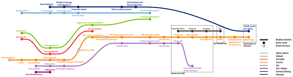
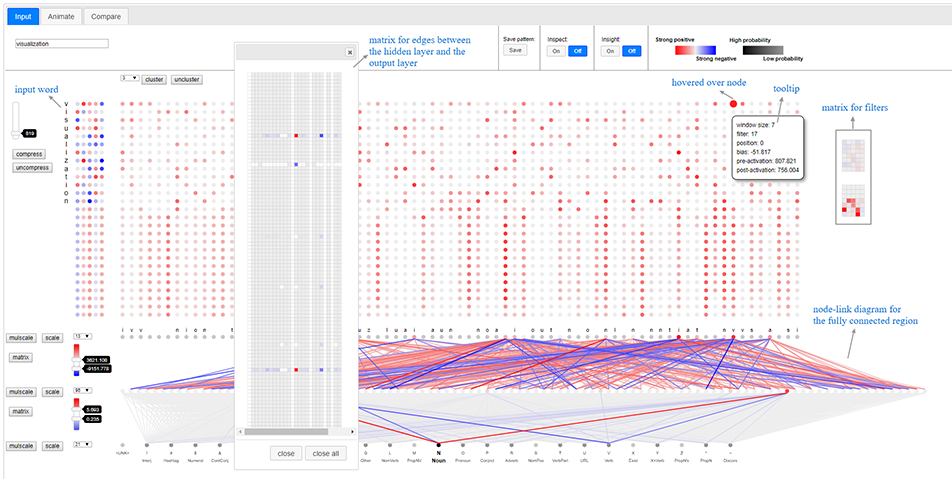
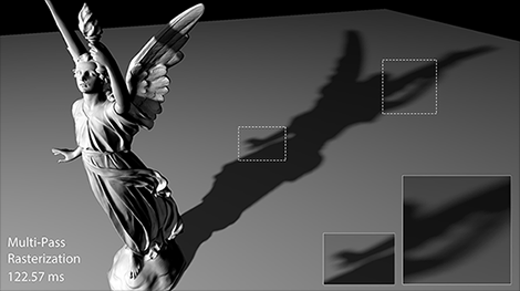
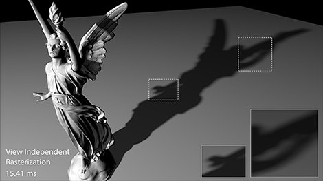
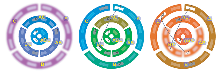
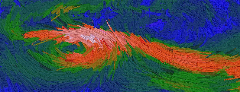
( PDF |
Poster )
( PDF |
PowerPoint Slides |
Quicktime Movie )
( PDF |
HTML )
( PDF | HTML )
( PDF | HTML )
( PDF | HTML )