Note: Work described within is a summary of a paper that was published in Proceedings Graphics Interface '98; a PDF version of the paper is available for downloading.
In order to demonstrate our techniques, we visualized an environmental dataset being used to model salmon growth and migration patterns. Data mining was used to identify significant attributes and to provide accurate estimates of plankton density. We used colour and texture to visualize the significant attributes and estimated plankton densities for each month for the years 1956 to 1964. Experiments run in our laboratory showed that the colours and textures we chose support rapid and accurate element identification, boundary detection, region tracking, and estimation. The result is a visualization tool that allows users to quickly locate specific plankton densities and the boundaries they form. Users can compare plankton densities to other environmental conditions like sea surface temperature and current strength. Finally, users can track changes in any of the dataset's attributes on a monthly or yearly basis.
The size of a dataset can be divided into three separate characteristics: the number of elements in the dataset, the number of attributes or dimensions embedded in each element, and the range of values possible for each attribute. All three characteristics may need to be considered during visualization.
Our approach to this problem combines an initial data filtering step and a perceptual visualization step. Data mining algorithms are used to identify dependencies, to estimate missing or correct erroneous values, and to compress a dataset's size and dimensionality. The results are displayed to the user in a manner that takes advantage of the low-level human visual system. Offloading the majority of the analysis task on the low-level visual system allows users to very rapidly and accurately perform exploratory visualization on large multidimensional datasets. Trends and relationships, unexpected patterns or results, and other areas of interest can be quickly identified within the dataset. These data subsets can then be further visualized or analysed as required.
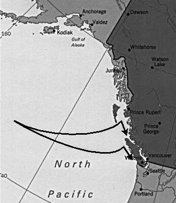
The oceanographers are designing models of how they believe salmon feed and move in the open ocean. These simulated salmon will be placed in a set of known environmental conditions, then tracked to see if their behaviour mirrors that of the real fish. For example, salmon that migrate back to the Fraser River to spawn chose one of two routes. When the Gulf of Alaska is warm, salmon make landfall at the north end of Vancouver Island and approach the Fraser River primarily via a northern route through the Johnstone Strait (the upper arrow in Figure 1). When the Gulf of Alaska is cold, salmon are distributed further south, make landfall on the west coast of Vancouver Island, and approach the Fraser River primarily via a southern route through the Juan de Fuca Strait (the lower arrow in Figure 1). The ability to predict salmon distributions from prevailing environmental conditions would allow the commercial fishing fleet to estimate how many fish will pass through the Johnstone and Juan de Fuca straits. It would also allow more accurate predictions of the size of the salmon run, helping to ensure that an adequate number of salmon arrive at the spawning grounds.
In order to test their hypotheses, the oceanographers have created a database of SSTs and ocean currents for the region 35 degrees north latitude, 180 degrees west longitude to 62 degrees north latitude, 120 degrees west longitude ( Figure 1). Measurements within this region are available at 1 degree by 1 degree grid spacings. This array of values exists for each month for the years 1956 to 1964, and 1980 to 1989
Plankton densities have also been collected and tabulated; these are obtained by ships that take readings at various positions in the ocean. Unfortunately, these measurements are much more sparse than the SST and current values. For the years 1956 to 1964, only 1,542 plankton densities are available. This leaves the oceanographers with a number of problems that need to be addressed before their salmon growth and movement models can be tested.
After using data mining to process the dataset, we must display it on-screen. We have approached the problems of dataset size and dimensionality by trying to exploit the power of the low-level human visual system. Research in computer vision and cognitive psychology provides insight on how the visual system analyses images. A careful mapping of data attributes to visual features (e.g., colour, intensity, and texture) will allow users to perform rapid visual analysis on their data. We must also avoid visual interference effects that can occur when different visual features are combined at the same spatial location. We are currently conducting experiments on the use of colour and texture for multidimensional data visualization [Hea96a]. Results from these experiments are used to visualize the oceanography datasets.
We are interested in data mining algorithms that perform classification. We believe that these algorithms can be used to improve the efficiency of visualizing large, multidimensional datasets. Their advantages are twofold. First, they can be used to reduce the amount of data that needs to be displayed. Second, they can be used to "discover" previously unknown and potentially useful information. For example:
All four data mining algorithms build their classification rules from a user-supplied training set. The decision tree algorithms begin by identifying significant attributes using chi-squared tests. The attribute that provides the largest information gain is used to partition the root of the tree. This process continues recursively using any remaining attributes. Leaves in the tree hold a single classification value. Unclassified elements match their attribute values against each node in the tree (i.e, the attribute values define a path from root to leaf through the tree). The leaf node's classification value is assigned to the element.
The statistical table algorithm uses probabilities to perform classification. For each attribute, a table is built containing every possible (attribute value, classification value) pair. Probabilities are computed for each pair. A positive probability suggests that (based on the training set) the given attribute value implies the given classification value; a negative probability means it implies some other classification value. Given an unknown element, the tables are used to compute probabilities for every possible classification value. The classification with the highest positive probability is assigned to the element.
The rough set algorithm uses set theory and equivalence relations to identify a subset of attributes that group classification values in a manner equivalent to the original attributes in the training set. Each attribute in the subset is assigned a coverage value; higher values imply greater importance during classification. The algorithm can then build rules that map combinations of attribute values to a classification value. Unclassified elements match their attribute values to each rule. The rule with the highest total coverage is used to assign a classification value to the element.
The data mining algorithms are designed to process a training set, then provide classification values for one or more unclassified elements. During visualization, however, users often require more than a simple classification value. We modified and extended the algorithms to provide additional results, in particular, classification confidence weights, the ability to compare different classifications, and the ability to identify attributes that are significant to a specific classification. This allows a user to answer questions like:
| SST (C) | SST < 6.34 | 6.34 <= SST < 8.98 | 8.98 <= SST < 11.82 | 11.82 <= SST < 14.80 | SST >= 14.80 |
| U | U < -0.6 | 0.6 <= U < -0.2 | 0.2 <= U < 0.2 | 0.2 <= U < 0.6 | U >= 0.6 |
| V | V < -0.6 | 0.6 <= V < -0.2 | 0.2 <= V < 0.2 | 0.2 <= V < 0.6 | V >= 0.6 |
| Str (cm/s) | Str < 6.087 | 6.087 <= Str < 9.015 | 9.015 <= Str < 11.567 | 11.567 <= Str < 14.542 | Str >= 14.542 |
| Plk (g/m^3) | Plk < 10 | 10 <= Plk < 28 | 28 <= Plk < 53 | 53 <= Plk < 114 | Plk >= 114 |
Table 1: Boundaries used to divide SST (measured in degrees Celsius), normalized current U and V direction, current strength (measured in centimetres per second), and plankton density (measured in grams per metre cubed) into five equal-width ranges
We started by reading the training set with each of our four data mining algorithms, then using significance weights to identify which attributes were being used to classify (i.e., estimate) plankton density. All our algorithms reported similar results: month was the most important attribute to use during classification, followed by current strength and SST. Other attributes (current direction and year) had a significance weight of zero. The oceanographers concurred with these results; plankton densities display a seasonal variability, large current upwellings will produce larger plankton blooms, and higher ocean temperatures cause faster plankton production and higher overall densities. These results allowed us to restrict our visualizations to month, SST, strength, and plankton density. The oceanographers searched these displays for temperature and current patterns, and their relationship to the corresponding plankton densities.
(b)
(c)
Once rules are built from the training set, each data mining algorithm can assign an estimated plankton density to unknown ocean positions based on SST, current strength, and month. This was done for all missing plankton densities for the years 1956 to 1964. We used the interval classification algorithm [Agr92], since it showed the smallest sensitivity to errors in its training set during prior testing [Hea96b]. Approximately 11% of the estimated plankton densities exhibited low confidence weights. Although these elements are included during visualization, we plan to examine them in isolation, to try to determine why the data mining algorithm had difficulty assigning them a density value. Initial investigation suggests that elements with certain combinations of month, SST, and current strength were not available in our training set. As a result, the data mining algorithms were uncertain about how to analyse these kinds of elements during classification.
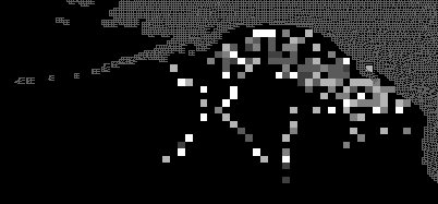
An example of our results is shown in Figure 2. The plankton densities that were actually available are shown in Figure 2a. Figure 2b shows missing values that have been estimated using interpolation. As expected, this technique performs poorly for locations in the ocean where no initial values are present. Most of the northwest and southwest quadrants have been classified to have moderate density; there is almost certainly more variation in this region, but the interpolation algorithms are unable to capture it. Data mining, on the other hand, uses the month, along with the underlying SSTs and current strengths, to estimate plankton density. In Figure 2c, the northwest quadrant has variability similar to that which exists across the known densities (Figure 2a). Although it is impossible to conclude that the values provided by the data mining algorithm are "more correct" than the interpolated values, our algorithms are not at a disadvantage when no real data values neighbour the value we want to estimate. Once we estimate missing plankton densities, we can begin designing a visualization tool to display the densities and their corresponding month, SST, and current strength.
Our interest is focused on identifying relevant results in the vision and psychology literature, then extending these results and integrating them into a visualization environment. We are currently studying perceptual aspects of colour, orientation, and texture. Results from our experiments have allowed us to build visualization tools that use these visual features to effectively represent multidimensional datasets. Because these tools take advantage of the low-level visual system, they offer a number of important advantages:
Experiments are also being run to study the use of perceptual textures for multidimensional data visualization. Texture has been studied extensively in the computer vision and psychology communities [Jul75, Tam78, Rao93, Ree93]. A number of visualization systems that use texture have been described, including the EXVIS system [Pic88], Liu and Picard's use of Wold features [Liu94], Li and Robertson's use of Markov random fields [Li95], and Ware and Knight's discussion of the fundamental dimensions of a texture element [War95].
We are interested in using perceptual textures to visualize multidimensional datasets. Perceptual textures differ from standard textures in computer graphics. As opposed to "texture maps" (patterns that are mapped onto regions of a graphical object), perceptual textures are arrays of elements with visual and spatial characteristics that are controlled by the underlying data being displayed. Research results suggest certain perceptual "dimensions" can be varied to control the appearance of the texture formed by the elements, for example:
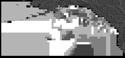
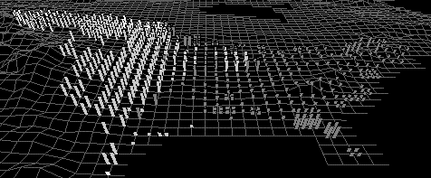
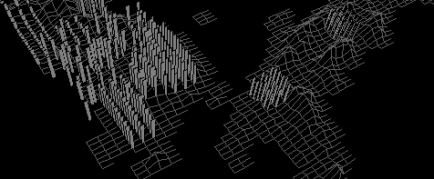
Figure 3b shows an environmental dataset being visualized with texture and greyscale (we used greyscale for printing purposes only; colour is used to display on-screen images). Locations on the map that contain strips represent areas in North America with high levels of cultivation. Height shows the level of cultivation (75% for short strips, 100% for tall strips), density shows the ground type (sparse for alluvial, dense for wetlands), and greyscale shows the vegetation type (dark grey for plains, light grey for forest, and white for woods). Users can easily identify lower levels of cultivation in the central and eastern plains. Areas containing wetlands can be seen as dense strips in Florida, along the eastern coast, and in the southern parts of the Canadian prairies. Figure 3c shows a map of central Japan and the Korean peninsula. As in Figure 3b, height is mapped to cultivation level and greyscale is mapped to vegetation type. In this image, however, randomness is mapped to ground type: regular for alluvial, and irregular for wetlands. Wetlands (i.e., strips with random placement) can be seen in the northwestern regions of the peninsula.
 Low |
 Medium |
 Tall |
 Sparse |
 Dense |
 Very Dense |
 Regular |
 Irregular |
 Random |
(b)
(c)
Although the experiments are still being run, preliminary results show that perceptual textures can be used to display multidimensional data. We have also compiled initial information on feature preference, feature interference, and the region size required for rapid identification. These results were used when we designed tools to visualize the oceanography datasets.
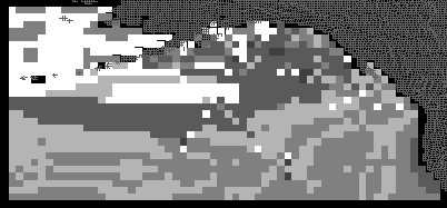
For the underlying texture, we mapped current strength to height and SST to density. Our choices were guided by results we observed from tests run during the design of our texture experiments, specifically:
The oceanographers want to traverse their datasets in monthly and yearly steps. Previous experiments run in our laboratory have shown that preattentive tasks performed on static frames can be extended to a dynamic environment, where displays are shown one after another in a movie-like fashion [Hea95]. Our visualization tool was designed to allow users to scan rapidly forwards and backwards through the dataset. This makes it easy to compare changes in the value and location of any of the environmental variables being displayed. The oceanographers can track seasonal changes in current strength, SST, and plankton density as they move month by month through a particular year. They can also see how interannual variability affects the environmental conditions and corresponding plankton densities for a particular month across a range of years.
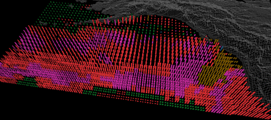
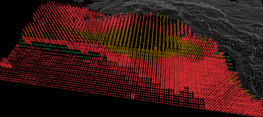
Figure 4 shows three frames from the oceanography dataset: February 1956, June 1956, and October 1956. Colour shows the seasonal variation in plankton densities. Height and density allow the oceanographers to track current strengths and SSTs. In February (Figure 4a), most plankton densities are less than 28 g/m^3 (i.e., blue and green strips). Currents are low in the north-central Pacific; a region of weak currents also sits off the south coast of Alaska. Most of the ocean is cold (sparse pexels), although a region of higher temperatures can easily be seen as dense pexels in the south. In June (Figure 4b) dense plankton blooms (red and purple strips) are present across most of the northern Pacific. The positions of the strong currents have shifted (viewing the entire dataset shows this current pattern is relatively stable for the months March to August). Warmer SSTs have pushed north, although the ocean around Alaska and northern British Columbia is still relatively cold. By October the plankton densities have started to decrease (green, brown, and red strips); few high or low density patches are visible. Current strengths have also decreased in the eastern regions. Overall a much larger percentage of the ocean is warm (i.e., dense pexels). This is common, since summer temperatures will sometimes last in parts of the ocean until October or November.
(b)
(c)
Experiments studying the use of height, density, and randomness to generate perceptual textures are still in progress. Once completed, we believe the results will allow us to increase the flexibility and effectiveness of our visualization tools. The oceanographers will begin testing salmon growth and migration models in the near future. We plan to use data mining to try to relate environment conditions to the simulated salmon, and to visualize the salmon as they move through the open ocean.
Although our practical example in this paper was an oceanographic dataset, data mining and perceptual visualization can be applied to a wide range of visualization environments. We have used perceptual colour selection to highlight regions of interest in reconstructed medical volumes [Tam97]. We have also used data mining to estimate sea surface temperatures in an environmental dataset from NASA [Hea96b]; we showed that our results were more accurate than estimates produced by bilinear interpolation. We will continue to test the flexibility of our techniques with new visualization problems and datasets.
| Agr92 | Agrawal, R., Ghosh, S., Imielinski, T., Iyer, B., and Swami, A. An interval classifier for database mining applications. In Proceedings 18th Very Large Database (VLDB) Conference (1992), pp. 560-573. |
| Cha91 | Chan, K. C. C., and Wong, A. K. C. A statistical technique for extracting classificatory knowledge from databases. In Knowledge Discovery in Databases, G. Piatetsky-Shapiro and W. J. Frawley, Eds. AAAI Press/MIT Press, Menlo Park, California, 1991, pp. 107-123. |
| Fra91 | Frawley, W. J., Piatetsky-Shapiro, G., and Matheus, C. J. Knowledge discovery in database: An overview. In Knowledge Discovery in Databases, G. Piatetsky-Shapiro and W. J. Frawley, Eds. AAAI Press/MIT Press, Menlo Park, California, 1991, pp. 1-27. |
| Hea95 | Healey, C. G., Booth, K. S., and Enns, J. T. Real-time multivariate data visualization using preattentive processing. ACM Transactions on Modeling and Computer Simulation 5, 3 (1995), 190-221. |
| Hea96a | Healey, C. G. Choosing effective colours for data visualization. In Proceedings Visualization '96 (San Francisco, California, 1996), pp. 263-270. |
| Hea96b | Healey, C. G. Effective Visualization of Large, Multidimensional Datasets. Ph.D. thesis, The University of British Columbia, Canada, 1996. |
| Jul75 | Julész, B. Experiments in the visual perception of texture. Scientific American (April, 1975), 34-43. | Koc93 | Kochevar, P., Ahmed, A., Shade, J., and Sharp, C. Bridging the gap between visualization and data management: A simple visualization management system. In Proceedings Visualization '93 (San Jose, California, 1993), pp. 94-101. |
| Li95 | Li, R., and Robertson, P. K. Towards perceptual control of Markov random field textures. In Perceptual Issues in Visualization, G. Grinstein and H. Levkowitz, Eds. Springer-Verlag, New York, New York, 1995, pp. 83-94. |
| Liu94 | Liu, F., and Picard, R. W. Periodicity, directionality, and randomness: Wold features for perceptual pattern recognition. In Proceedings 12th International Conference on Pattern Recognition (Jerusalem, Israel, 1994), pp. 1-5. |
| Pic88 | Pickett, R., and Grinstein, G. Iconographic displays for visualizing multidimensional data. In Proceedings of the 1988 IEEE Conference on Systems, Man, and Cybernetics (Beijing and Shenyang, China, 1988), pp. 514-519. |
| Qui86 | Quinlan, J. R. Induction of decision trees. Machine Learning 1, 1 (1986), 81-106. |
| Rao93 | Rao, A. R., and Lohse, G. L. Identifying high level features of texture perception. CVGIP: Graphics Models and Image Processing 55, 3 (1993), 218-233. |
| Ree93 | Reed, T. R., and Hans Du Buf, J. M. A review of recent texture segmentation and feature extraction techniques. CVGIP: Image Understanding 57, 3 (1993), 359-372. |
| Ros94 | Rosenblum, L. J. Research issues in scientific visualization. IEEE Computer Graphics & Applications 14, 2 (1994), 61-85. |
| Sil90 | Silbershatz, A., Stonebraker, M., and Ullman, J. D. The "Lagunita" report of the NSF invitational workshop on the future of database systems research. Tech. Rep. TR-90-22, Department of Computer Science, University of Austin at Texas, 1990. |
| Sto93 | Stonebraker, M., Chen, J., Nathan, N., Paxson, C., Su, A., and Wu, J. Tioga: A database-oriented visualization tool. In Proceedings Visualization '93 (San Jose, California, 1993), pp. 86-93. |
| Tam78 | Tamura, H., Mori, S., and Yamawaki, T. Textural features corresponding to visual perception. IEEE Transactions on Systems, Man, and Cybernetics SMC-8, 6 (1978), 460-473. |
| Tam97 | Tam, R., Healey, C. G., and Flak, B. Volume visualization of abdominal aortic aneurysms. In Proceedings Visualization '97 (Phoenix, Arizona, 1997), pp. 43-50. |
| Tho92 | Thomson, K. A., Ingraham, W. J., Healey, M. C., LeBlond, P. H., Groot, C., and Healey, C. G. The influence of ocean currents on the latitude of landfall and migration speed of sockeye salmon returning to the Fraser River. Fisheries Oceanography 1, 2 (1992), 163-179. |
| Tho94 | Thomson, K. A., Ingraham, W. J., Healey, M. C., LeBlond, P. H., Groot, C., and Healey, C. G. Computer simulations of the influence of ocean currents on Fraser River sockeye salmon (oncorhynchus nerka) return times. Canadian Journal of Fisheries and Aquatic Sciences 51, 2 (1994), 441-449. |
| Tre89 | Treinish, L. A., Foley, J. D., Campbell, W. J., Haber, R. B., and Gurwitz, R. F. Effective software systems for scientific data visualization. Computer Graphics 23, 5 (1989), 111-136. |
| Tre93 | Treinish, L. A. Unifying principles of data management for scientific visualization. In Animation and Scientific Visualization, R. Earnshaw and D. Watson, Eds. Academic Press, New York, New York, 1993, pp. 141-170. |
| War88 | Ware, C. Color sequences for univariate maps: Theory, experiments, and principles. IEEE Computer Graphics & Applications 8, 5 (1988), 41-49. |
| War95 | Ware, C., and Knight, W. Using visual texture for information display. ACM Transactions on Graphics 14, 1 (1995), 3-20. |
| Zia91 | Ziarko, W. The discovery, analysis, and representation of data dependencies in databases. In Knowledge Discovery in Databases, G. Piatetsky-Shapiro and W. J. Frawley, Eds. AAAI Press/MIT Press, Menlo Park, California, 1991, pp. 195-209. |