 (a) |
 (b) |
[ Home Page ] [ NCSU CS Home Page ] [ NCSU Home Page ]
Note: Work described within is a summary of a paper that was published in IEEE Computer Graphics & Applications; a PDF version is available for downloading.
Scientific visualization represents information as images that allow us to explore, discover, analyze, and validate large collections of data. Much of the research in this area is dedicated to the design of effective visualizations that support specific analysis needs. Recently, we have become interested in a new idea: Is a visualization beautiful? Can a visualization be considered a work of art?
One might expect answers to these questions to vary widely depending on the individual and their interpretation of what it means to be artistic. We believe that the issues of effectiveness and aesthetics may not be as independent as they might seem at first glance, however. Much can be learned from a study of two related disciplines: human psychophysics, and art theory and history. Perception teaches us how we "see" the world around us. Art history shows us how artistic masters captured our attention by designing works that evoke an emotional response. The common interest in visual attention provides an important bridge between these domains. We are using this bridge to produce visualizations that are both effective and engaging. This article describes our research, and discusses some of the lessons we have learned along the way.
Work in our laboratory has studied various issues in scientific visualization for much of the last ten years. A large part of our effort has focused on multidimensional visualization, the need to visualize multiple layers of overlapping information simultaneously in a common display or image. We often divide this problem into two steps: (1) the design of a data-feature mapping M, a function that defines visual features (e.g., color, texture, or motion) to represent the data, and (2) an analysis of a viewer's interpretation of the images M produces. An effective M generates visualizations that allow viewers to rapidly, accurate, and effortlessly explore their data.
One promising technique we have discovered is the use of results from human perception to predict the performance of a particular M. The low-level visual system identifies certain properties of what we see very quickly, often in only a few tenths of a second or less. Perhaps more importantly, this ability is display size insensitive; visual tasks are completed in a fixed length of time that is independent of the amount of information being displayed. Obviously, these findings are very attractive in a multidimensional visualization context. Different visual features can be combined to represent multiple data attributes. Large numbers of these "multidimensional data elements" can be packed into an image. Sequences of images are then rapidly analyzed by a viewer in a movie-like fashion.
Figure 1: Two examples of visualizing weather conditions: (a) traditional visualizations for each attribute composited into a single image; (b) simulated brush strokes that vary their color and texture to visualize the data
Fig. 1 shows two example visualizations of multidimensional weather data. The first image was constructed by taking traditional visualizations of each attribute, then compositing them together. Hue represents temperature (yellow for hot, green for cold), luminance represents pressure (bright for high, dark for low), directed contours represent wind direction, and Doppler radar traces represent precipitation. The second image was built using simulated brush strokes that vary their perceptual color and texture properties to visualize the data. Here, color represents temperature (bright pink for hot, dark green for cold), density represents pressure (denser for lower pressure), stroke orientation represents wind direction, and size represents precipitation (larger strokes for more rainfall). Although viewers often gravitate towards the first image due to its familiarity, any attempt to perform real analysis tasks leads to a rapid appreciation of the careful selection of colors and textures used in the second image. Experiments showed that viewers prefer the second image for the vast majority of the tasks we tested.
The use of perceptual guidelines can dramatically increase the amount of information we can visualize. We cannot take advantage of these strengths with an ad-hoc choice of M, however. Certain combinations of visual features actively mask information by interfering with our ability to see important properties of an image. A key goal, therefore, is to build guidelines on how to design effective visualizations, and to present these findings in a way that makes them accessible to other visualization researchers and practitioners.
During the last year, we have started to consider a second question: "How can we make our visualizations engaging or aesthetic?" Although this issue has only recently received attention in the visualization community, we feel it is an important factor worthy of study. An image that is seen as interesting or beautiful can encourage viewers to study it in detail. Stylistic techniques that capture and focus attention on certain areas of a painting might be used to highlight interesting or unexpected properties in the data. We expect the lessons learned from studying the work of master painters to have a significant impact on the quality of visualizations we produce.
At first glance the areas of perception and painting might appear completely independent of one another. In fact, we have found an important overlap between the brush style properties used in Impressionist painting, and the fundamental visual features detected by the low-level visual system. This correspondence between low-level visual features and painterly styles is critical for our work, since it allows us to design visualizations that are both effective and aesthetic.
One of the most important lessons of the past twenty-five years of research in psychophysics is that human vision does not resemble the relatively faithful and largely passive process of modern photography. The goal of human vision is not to create a replica or image of the seen world in our heads. A much better metaphor for vision is that of a dynamic and ongoing construction project, where the products being built are short-lived models of the external world that are specifically appropriate for the current visually guided tasks of the viewer. There does not appear to be any general purpose vision. What I "see" when confronted with a new scene depends as much on my goals and expectations as it does on the array of light that bombards my two eyes.
Among the research findings responsible for this altered view of "seeing" is a greater appreciation of:
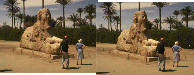
Figure 2: An example of change blindness, the inability to quickly identify significant differences across separate views of a common scene; try to identify the difference between the two photographs (the answer is included in the text below; photo courtesy Ron Rensink)
The reality of each of these findings can be illustrated through the so-called change blindness which affects us all [Ren01]. It involves a task similar to a game that has amused children reading the comic strips for many years. Try to find the difference between the two pictures in Fig. 2. Many viewers have a difficult time seeing any difference and often have to be coached to look carefully to find it . Once they have found it, they realize that the difference was not a subtle one. Change blindness is not a failure to see because of limited visual acuity; it is rather a failure based on inappropriate attentional guidance. Some parts of the eye and the brain are clearly responding differently to the two pictures. Yet, this does not become part of our visual experience until attention is focused directly on the objects that differ.
Harnessing human vision effectively for the purposes of data visualization therefore requires that the displays themselves be constructed so as to draw attention to important parts of themselves. Since the displays being viewed are typically novel, we cannot rely on the expectations that might accompany the viewing of a familiar scene. Rather, we must rely on an effective mapping between data values and features, so that differences in the visual features draw the eyes, and more importantly the mind, on their own. Luring the viewer's eyes to a particular object or location in the scene is the first step in having the viewer form a mental representation of that part of the scene that may outlast the next glance or scene that comes into view.
Our interest in artistic visualizations naturally led us to explore in two directions: nonphotorealistic rendering in computer graphics, and art history and art theory discussions of known painterly styles.
Nonphtorealistic rendering converts pictures or 3D geometric scenes into nonphotorealistic images. Rather than trying to generate results that are indistinguishable from photographs of an equivalent scene (i.e., photorealistic rendering), nonphotorealistic techniques draw their inspiration from artistic works to produce pen-and-ink sketches, cartoon cels, and paintings that simulate pencil and charcoal, watercolor, and oil-based brush strokes [Goo01]. The proper use of these strokes results in images that "guide the eye" much more effectively than more realistic photographs, in part because large differences in visual properties can be made to coincide with those scene locations that the artist wishes to have the viewer spend the most time examining. Some researchers in visualization have already started to use these ideas as inspiration for painterly visualization techniques [Lai01, Rhe01]. We are focusing on methods that use collections of simulated brush strokes to produce a nonphotorealistic image. We plan to visualize a multidimensional data element with one or more brush strokes, where the visual properties of the stroke are controlled by the attribute values embedded in the element.
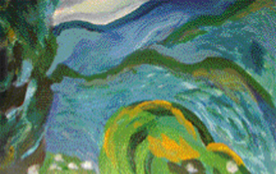
Figure 3: A close-up view of an oil painting that demonstrates various stroke styles like color, path, size, and density (painting courtesy Laura Tateosian)
Our study of painterly styles from art history was initially restricted to a particular movement known as Impressionism. This term was attached to a small group of French artists (initially including Monet, Degas, Manet, Renoir, and Pissarro, and later Cezanne, Sisley, and Van Gogh, among others) who broke from the traditional schools of the time to approach painting from a new perspective. Our decision to study the Impressionists was motivated in part by a need to narrow our initial focus to a single type of painting style, in part by the Impressionists careful study of color, light, and object in their paintings, and in part by a personal appreciation of these artists. Properties of hue, luminance, and lighting were explicitly controlled and even studied in a scientific fashion by some of the Impressionists [Sch97]. The painterly styles of these artists can be further refined by studying the paintings themselves. Examples include the path of the brush strokes (e.g., straight or curved), their length and density, their coarseness due to the brush used to paint the stroke, and the weight of paint applied to each stroke.
We observed that many of the painterly styles we discovered seemed to have a close correspondence to visual features from our perceptual visualizations. For example, color and lighting in Impressionism have a direct relationship to the use of hue and luminance in visualization. Other styles like path, density, and length have partners like orientation, contrast, and size in perception. This suggested the following strategy to produce a visualization that is both effective and aesthetic:
Indeed, this technique can be used to generate painterly visualizations of multidimensional data. In spite of this success, however, we were still left to wonder: "Are these visualizations effective?" and "Are these visualizations aesthetic?"
The guidelines we use to build our perceptual visualizations come from psychophysical experiments that measure the absolute performance of different visual features, and the interactions that occur between them. We conducted a similar set of experiments, but with simulated brush strokes substituted for the original perceptual glyphs. This produced painterly images with strokes that varied in their color, orientation, density, and regularity of placement.
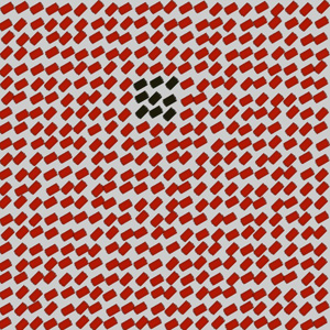
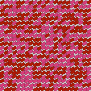
Figure 4. Example displays from the effectiveness experiment: (a) green target in orange strokes, random background orientation, dense packing, irregular placement; (b) 45-degree target in 30-degree strokes, random background colors, very dense packing, irregular placement
Fig. 4 shows examples from the experiments we ran. Half of the displays contained a randomly located group of target strokes defined by a difference in a target style (e.g., color in Fig. 4a and orientation in Fig. 4b). Some displays randomly vary a background style (e.g., orientation during the search for a color target in Fig. 4a, and color during the search for an orientation target in Fig. 4b). This allowed us to test for visual interference, a situation where variations in a background style inhibit a viewer's ability to identify the target. Each display was shown to a viewer for 200 milliseconds, after which the screen was cleared. The viewer was then asked to answer whether a target group of strokes was present or absent in the display.
Our analysis of viewer accuracy mirrored the findings from our original visual perception experiments (see [Hea99] for a complete explanation of these results). Features that were salient in our original perceptual visualizations were salient in the painterly images. Interference patterns were also identical. This suggests we can use our existing rules of perception to build painterly representations to visualize effectively values in an underlying dataset. It also suggests that any new guidelines we discover could be extended to our painterly environment.
Although our initial experiments showed that our painterly visualizations are effective, we still had no evidence of their aesthetic merit. We ran a new set of experiments designed to investigate this property. These experiments studied three important questions:
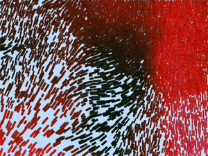
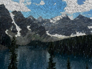
Figure 5. Example displays from the aesthetic judgement experiment: (a) a painterly visualization of weather conditions; (b) a nonphotorealistic rendering of a photograph of Lake Moraine in Banff, Canada
Our experiments asked viewers to order 28 images on a scale from 1 (lowest) to 7 (highest). We presented seven images from four different categories: master Impressionists (impressionism), master Abstractionists (abstractionism), nonphotorealistic renderings (nonphotorealism), and painterly visualizations (visualization).
An example of the painterly visualizations we tested is shown in Fig. 5a. Although real weather conditions are being visualized (temperature is represented by color, wind speed by coverage, pressure by size, and precipitation by orientation), no explanations were provided to our viewers about what was being depicted. We were careful to zoom in to a point where viewers would not interpret the image as part of a map. These images were classified as abstract in nature, since they had no obvious relationship to a real-world object or scene. They were paired against seven real paintings by master Abstractionists: one painting each by de Kooning, Johns, Malevich, Mondrain, and Pollock, and two by Kline.
Since we derived many of our original painterly styles from the Impressionists, we wanted to include their works in our experiment. We picked seven paintings: one each by Cézanne, Monet, Morisot, Pissarro, Seurat, Sisley, and Van Gogh. We counterbalanced these paintings with seven nonphotorealistic renderings. Fig. 5b shows one of the renderings, a picture of a mountain lake. These images were based on underlying photos, and applied exactly the same brush strokes and painting scheme that we used to generate our painterly visualizations. This was easy to do, since a photo is also a dataset with three dimensions: red, green, and blue.
Viewers were asked to rank the 28 images for five different questions. The first asked about the artistic merit of the images. The other four were designed to probe a viewer's emotional responses. Each ranking was conducted in a similar fashion. For example, during the ranking of artistic merit, viewers were asked:
"As a first step, I would like you to look through this entire set of pictures in order to choose one picture that you like the best. This is a picture that you would like to place as art somewhere in your house or at your place of work. It's the one you think is the best example of 'good art.'
Now look through the remaining pictures and choose the one that you think is the worst example of art.
I would now like you to go through the rest of these pictures in the order in which they come up and assign each one a number from 1 to 7. If the picture is as good as the one you chose to be 'best,' then give it a 7. If it is as bad as the one you chose to be 'worst,' give it a 1. If it somewhere in between, then choose an appropriate number between 1 and 7. Remember, 7 represents the best art. Please use the whole range of numbers to the best of your ability."
The remaining four questions asked viewers to do an identical ranking based on how "emotionally pleasing" the images were (emotionality), how "active" they were (arousal), how much "meaning" they contained (meaning), and how "complex" they were (complexity). The first two questions were selected using the emotional circumplex, a theory that models eight basic human emotions around the two orthogonal dimensions of pleasure and arousal [Bar99]. The second two questions were designed to measure composition around the two dimensions abstract-real and visual complexity.
Although our results are still preliminary, we have already discovered a number of interesting and exciting findings. Twenty of the twenty-five viewers we tested ranked the master Impressionists as most artistic, followed by the nonphotorealistic renderings, then the master Abstractionists and painterly visualizations. These viewers consistently preferred realistic images over abstract ones. In fact, they judged the nonphotorealistic images as more artistic, on average, than the Abstractionist paintings. This was not because the viewers felt that abstract images were completely lacking in artistic merit (the abstract images received an average rank of 2.97). They simply preferred realism over abstractionism. Emotionality and meaning predicted 90% of the variance in viewer responses. If viewers who liked realism found an image pleasing and meaningful, they felt it was highly artistic.
Five of our viewers had a very different set of rankings. They judged the painterly visualizations as most artistic, followed by the master Abstractionists, then the master Impressionists and nonphotorealistic renderings. These viewers clearly preferred abstract images over realistic ones, ranking the visualizations as more artistic than the Impressionist paintings. For these viewers, arousal was the most important predictor of artistic merit: when they found an image active, they tended to feel it was highly artistic.
One final point of interest is that our results show that computer-generated images can be seen as highly artistic. People who preferred realism felt the nonphotorealistic renderings were artistic. People who preferred abstractionism felt the painterly visualizations were artistic. We were initially concerned that viewers might believe a computer-generated image could never be seen as "art." Our results suggest that this is not true.
In order to tie these ideas together, we present a final painterly visualization from the application testbed we have used throughout much of this paper: a dataset of monthly environmental and weather conditions collected and recorded by the Intergovernmental Panel on Climate Change. This dataset contains mean monthly surface climate readings in 1/2-degree latitude and longitude steps for the years 1961 to 1990 (e.g., readings for January averaged over the years 1961-1990, readings for February averaged over the years 1961-1990, and so on).
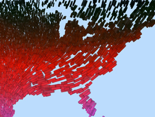
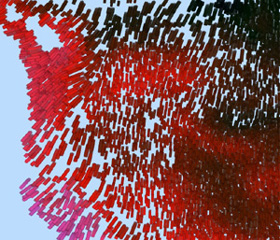
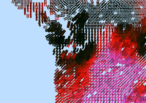
Figure 6: Painterly visualization of weather conditions over the continental United States: (a) weather conditions for February over the eastern United States; (b) weather conditions for February over the west coast
We visualize temperature, wind speed, pressure, and precipitation with a data-feature mapping M that assigns brush stroke color, coverage, size, and orientation, respectively. Temperature is shown with colors selected uniformly from a perceptually balanced color path that runs from dark blues and greens (for cold temperatures) to bright pinks (for hot temperatures). Wind speed is shown with coverage (i.e., the amount of an element's spatial region covered by its brush strokes). Coverages range exponentially from very small (for little or no wind) to full (for strong winds). Pressure is shown with sizes ranging from small (for low pressure) to large (for high pressure). Finally, precipitation is shown with by orientations ranging from 0-degrees or upright (for no precipitation) to 90-degrees or flat (for heavy precipitation).
Fig. 6a shows a visualization of data for February across the eastern United States. Fig. 6b shows data for the same month along the west coast. Although unlikely to be mistaken for a real Impressionist painting, we feel these images contain important aesthetic qualities that make them stand out from traditional visualizations. Color and texture patterns representing different weather phenomena can be seen within these images. For example, Fig. 6a shows the expected cold to hot temperature gradient (dark blue strokes to bright pink strokes) running north to south, light rain and strong winds (upright strokes that fully cover the background canvas) in the center of the country, and heavy rain and weak winds (tilted strokes with low coverage) in the south and northeast of the Great Lakes. Fig. 6b highlights the warmer temperatures and heavy rainfall (tilted pink and red strokes) typically found in the Pacific Northwest around Seattle and Olympia during the winter months.
The authors thank Mark Rempel for his help with data collection and analysis, and for his insightful comments on our results. The authors also thank Laura Tateosian for the landscape portrait she painted to provide examples of brush stroke properties. Finally, the authors thank Ron Rensink for his images of change blindness, and for his suggestions about the use of perception for scientific visualization. This work is funded in part by the National Science and Engineering Research Council of Canada, and by the National Science Foundation grants IIS-9988507 and ACI-0083421.