Introduction
This project studies ways to estimate and
visualize sentiment for short, incomplete text
snippets. Sentiment is defined as
"an
attitude, thought, or judgement prompted by feeling." Our
specific goal is a visualization that presents basic emotional
properties embodied in the text, together with a measure of the
confidence in our estimates.
We are currently focused on visualizing the sentiment of social
media text posted on sites like Reddit or
Threads,
online social media networks that users to upload short text messages,
links, images, and videos. These sites can server as more than a
method of informal communication. Twitter (now X) showed the potential
for societal impact in its use
as a
communication and organizing tool for activists during the 2011
"Arab Spring" protests in various Middle Eastern
countries.
Web Application
You can try the social media visualizer online. It's been
tested in Firefox, Chrome, Edge, Safari, and Opera.
Visualizing Social Media
Examples of the visual features assigned to a circle to represent
its post's estimated sentiment: colour—blue for unpleasant,
green for pleasant; brightness—brighter for more aroused;
size and transparency—larger and more opaque for more
confidence in the sentiment estimate
Collections of posts are visualized in numerous ways: by
sentiment, by topic, by frequent terms, and so on. Individual posts
are drawn as circles. Each circle's colour, brightness, size, and
transparency visualize different details about the sentiment of its
post:
- Colour, the overall valence or pleasure of the post:
pleasant posts are green, and unpleasant posts are blue.
- Brightness, the overall arousal of the post: active
posts are brighter, and subdued posts are darker.
- Size, one measure of how confident we are about the
estimate of the post's sentiment: larger posts represent more
confident estimates.
- Transparency, a second measure of how confident we are
about its estimate of the post's emotion: more opaque (i.e. less
transparent) posts represent more confident estimates.
Representing Emotion
In psychology, emotional models have been proposed to define and
compare emotional states. These models often use emotional dimensions
to position emotions on a 2D plane. The simplest models represents
pleasure along a horizontal axis, with highly unpleasant on one end,
highly pleasant on the other, and different levels of pleasure in
between. More complex models use more than a single dimension. For
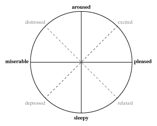
example, Russell proposed using valence (or pleasure)
and arousal (or activation) to build an emotional circumplex
of affect. Russell applied multidimensional scaling to position 28
emotional states, producing the model shown to the left with valence
running along the horizontal axis and arousal along the vertical
axes. The intermediate terms excited–depressed and
distressed–relaxed are polar opposites formed by intermediate
states of valence and arousal. Similar models have been proposed by
Watson and Tellegen (with positive and negative valence axes), Thayer
(with tension and energy axes), and Larsen and Diener (with pleasure
and activation axes similar to Russell's).
Estimating Sentiment
Computational methods to estimate sentiment include machine
learning algorithms like naive Bayesian networks, support vector
machines, and maximum entropy approaches, or combinations of
common-sense reasoning and affective ontologies—e.g., sentic
computing—to perform a concept-level analysis of natural
language text.
One requirement for these traditional approaches is sufficient
high-quality text to allow for accurate natural language
evaluations. Some researchers argue that this is not necessarily
available in short text snippets like posts, instant messages, or SMS
texts. Several researchers have suggested an alternative method: the
use of dictionaries that report the sentiment of a set of words along
one or more emotional dimensions. Examples of sentiment dictionaries
includes POMS
and POMS-ex—Profile of Mood States—and ANEW—Affective
Norms for English Words.
We chose to build our own dictionary, using a combination of terms
from ANEW, an extended ANEW
dictionary that was recently built by researchers McMaster and
Ghent Universities, and a happiness
dictionary built by researchers at the University of Vermont.
Our sentiment dictionary provides measures of valence and arousal
for approximately 10,680 English words. Each word is rated on a
nine-point scale ranging from 1 to 9. Words included in the dictionary
were selected from previous research that identified them as good
candidates to convey emotion. For example, to construct the ANEW
dictionary, volunteers were asked to read a text corpus and provide a
rating along each dimension for each occurrence of an ANEW-recognized
word. Ratings for a common word are combined into a mean rating and a
standard deviation of the ratings for each dimension. For example, for
the word house, ANEW reports:
- house, v = (μ: 7.26, σ:
1.72), a = (μ: 4.56, σ: 2.41), fq =
591
This shows that house has a mean valence v
of 7.26 and a standard deviation of 1.72, a mean arousal a of
4.56 and a standard deviation of 2.41, and a frequency fq of
591 ratings.
We decided to use ANEW's approach of valence and arousal ratings to
estimate the pleasure and arousal for a post's text. We performed
post-processing to get full valence and arousal means and standard
deviations for terms from the extended ANEW and happiness
dictionaries. One consequence of this is that not all the terms
included in these sources are present in our own sentiment dictionary.
Given our dictionary, the following steps are used to estimate an
overall valence and arousal for each post:
- Capture the post's body through the social media site's search
API.
- For each word wi in the post that exists in
the sentiment dictionary, save the word's mean valence and arousal
μv,i and μa,i and
standard deviation of valence and arousal
σv,i and
σa,i.
- If a post contains less than n = 2 sentiment words,
ignore it as having an insufficient number of ratings to estimate
its sentiment.
- Statistically average the n means and standard
deviations to compute the post's overall mean valence and arousal
Μv and Μa.
For example, consider the following post from a query posts
containing the two keywords "health care". Words in bold
italics are words that occur in the sentiment dictionary.
- Congrats to @HCP_Nevada on their health care
headliner win!
Our measure of the n = 2 words' means and standard
deviations of valence and arousal are:
- health, v = (μ: 6.81, σ:
1.88), a = (μ: 5.13, σ: 2.35), fq =
105
- win, v = (μ: 8.38, σ:
0.92), a = (μ: 7.72, σ: 2.16], fq =
55
To combine the means for health
and win, we assume that the individual ratings
reported for each word form a normal distribution. Intuitively, if a
word has a higher standard deviation, for example, a higher
σv,i for valence, the valence ratings for
the word were spread across a wider range of values. If
σv,i were lower, ratings for the word
clustered closer to the mean. Based on this, we use
the probability
density function of a normal distribution to estimate the
probability density of the word's rating falling exactly at the mean. The
probabilities are applied as weights when we sum the means. Using this
formula, we compute an overall mean valence and arousal of:
Notice that if we'd simply used an arithmetic mean to compute the
overall mean valence Μv, we would have reported
Μv = (6.81 + 8.38) / 2 = 7.59. However, the
standard deviation of valence for health
(σv,1 = 1.88) is higher than the standard
deviation for win (σv,2 =
0.92). Because of this, we weight win's mean valence
μv,2 = 8.38 higher
than health's μv,1 = 6.81. The
result is an overall mean Μv = 7.86 that falls
closer to win's mean valence. A similar result can be
seen for overall mean arousal Μa.
Visualization Techniques
Posts are presented using several different visualization
techniques. Each technique is designed to highlight different aspects
of the posts and their sentiment.
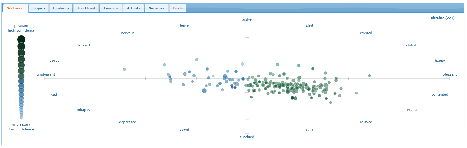
Sentiment Tab
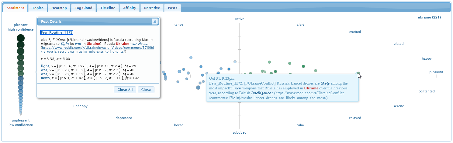
The sentiment tab visualizes where posts lie in an emotional
scatterplot with pleasure and arousal on its horizontal and vertical
axes. The spatial distribution of the posts summarizes their overall
sentiment.
Hover the mouse cursor over a post to reveal its body. Words in
the sentiment dictionary are highlighted in bold italics. Clicking on
a post generates a detail dialog with the overall pleasure and
arousal for the post, as well as each dictionary term's mean and
standard deviation of pleasure, mean and standard deviation of
arousal, and frequency. Recall that the dictionary's pleasure and
arousal estimates were made on a nine-point scale ranging from 1 to
9.
Topics Tab
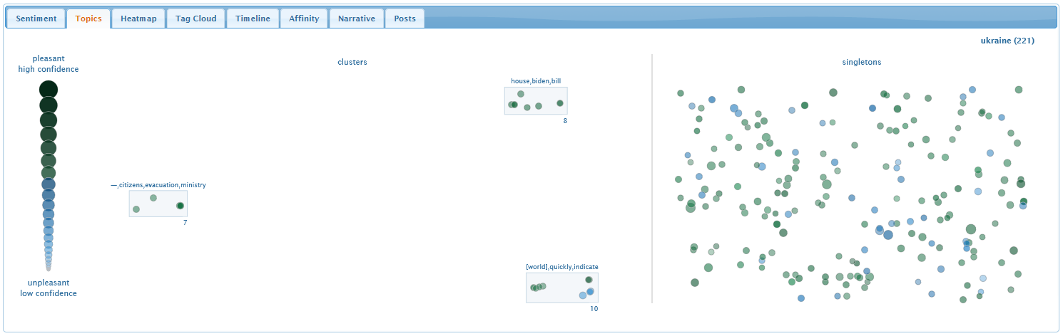
The topic tab identifies posts that are discussing a common topic
or theme. Each topic is visualized as a rectangular group of posts,
with keywords at the top to summarize the topic, and a number at the
bottom to identify the number of posts in the cluster.
Posts within each cluster are laid out so that the distance
between them shows their text similarity: closer for stronger
similarity. Topic cluster rectangles are positioned in the same way:
closer for more similar topics. Posts that are not part of any topic
are visualized as singletons on the right.
As with the sentiment tab, hovering the mouse over a post or
clicking a post reveals more details about its content and its
estimated sentiment.
Heatmap Tab
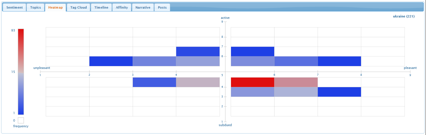
The heatmap visualizes the number of posts within different
sentiment regions. It highlights "hot" red regions with many posts,
and "cold" blue regions with only a few posts.
The emotional scatterplot is subdivided into an
8 × 8 grid of bins representing one-unit steps in
pleasure and arousal. The number of posts falling within each bin is
counted and visualized using colour: red for bins with more posts
than average, and blue for bins with fewer posts than average. White
bins contain no posts. Stronger, more saturated colours lie farther
from the average.
Hovering the mouse over a heatmap bin reveals the number of posts
that lie in the bin.
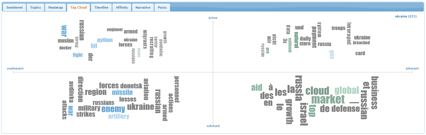
Tag Cloud Tab
The tag cloud visualizes the most frequently occurring terms in
four emotional regions: upset in the upper-left, happy in the
upper-right, relaxed in the lower-right, and unhappy in the
lower-left. A term's size shows how often it occurs over all the
posts in the given emotional region. Larger terms occur more
frequently. A term's colour and brightness show its estimated pleasure
and arousal. Grey terms are not recognized in our sentiment
dictionary, and therefore have no estimated sentiment.
Hovering the mouse over a term reveals its frequency.
We use
a tag
cloud algorithm for
D3's Javascript
visualization library to render the tag cloud.
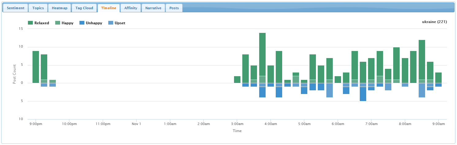
Timeline Tab
The timeline visualizes when posts were posted. Pleasant posts
are shown in green above the horizontal axis, and unpleasant posts in
blue below the axis.
The height of a bar in the graph shows the number of posts posted
over the time range covered by the bar. Bars are split into four
segments representing the number of relaxed and happy posts—in
dark green and light green—and the number of unhappy and upset
posts—in dark blue and light blue.
Hovering the mouse over a bar segment reveals the number of posts
of that type posted at the given time.
We use the Highcharts Javascript library to render the bar
chart.
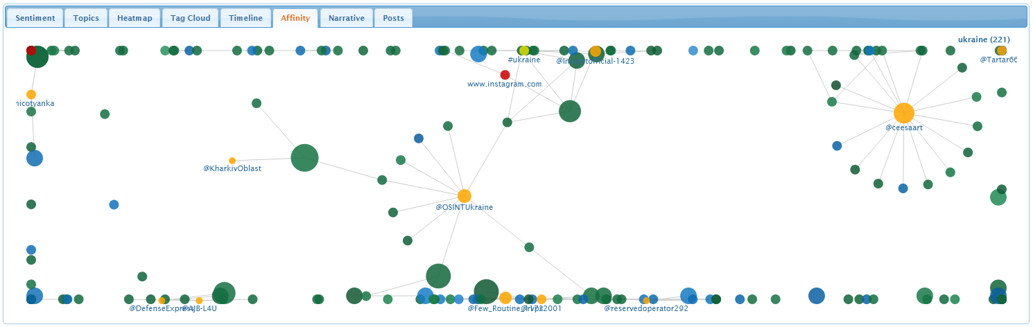
Affinity Tab
The affinity graph visualizes frequent posts, people, hashtags,
and URLs, together with relationships or affinities between these
elements.
Blue and green nodes represent posts, orange nodes represent
people, yellow nodes represent hashtags, and red nodes represent
URLs. Larger node show more frequent elements. Links between nodes
highlight relationships, for example, posts that are similar to one
another, or hashtags and people that occur in a set of posts.
Hovering the mouse over a node reveals its frequency. Clicking
post or URL nodes reveal more details about the node's content.
We use
a
force-directed graph algorithm from
D3's Javascript
visualization library to render the affinity graph.
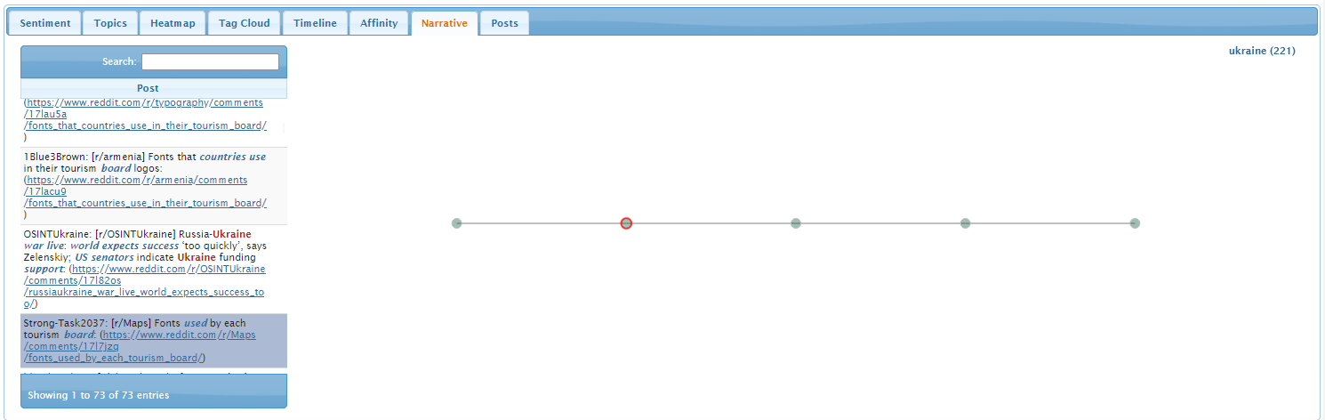
Narrative Tab
The narrative tab visualizes narrative threads, sets of posts that
form conversations about a common topic over time.
Select a post of interest from the post list on the left side of
the screen. Any narrative threads that pass through the selected post
will be rendered as a graph on the right side of the screen. The
selected post is outlined in red.
Hovering the mouse over a post or clicking on a post reveals more
details about its content and its estimated sentiment. Hovering the
mouse over a link reveals more details about the two posts at the
ends of the link, and highlights all narrative threads that pass
through the link. Clicking on a link displays a dialog containing
details about the posts in the narrative threads that pass through
the link.
We use the DataTables plugin for
the jQuery Javascript
library to render the post list table.
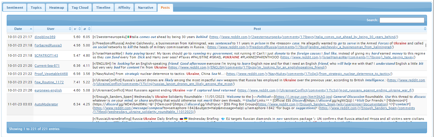
Posts Tab
The posts tab shows the date, author, and body of each post, as
well as its overall pleasure v and
arousal a. Dictionary terms in each post are highlighted in
bold italics.
Click on a column header to sort by that column, or to reverse the
sort order between ascending and descending. Type text in the Search
field to search for posts containing any text of interest. Click on a
post author's ID to see the author's post stream, or on any
URL to open the URL.
We use the DataTables plugin for
the jQuery Javascript
library to render the table.